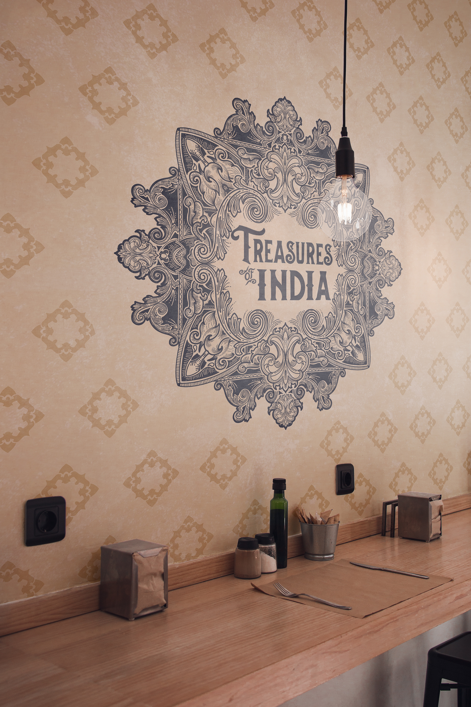
Treasures of India
This is my branding for ‘Treasures’ a project born out of my love to explore. First up is a country that is wild, beautifully chaotic, splashed with colours, incredibly diverse and like nothing I’ve experienced!
Branding
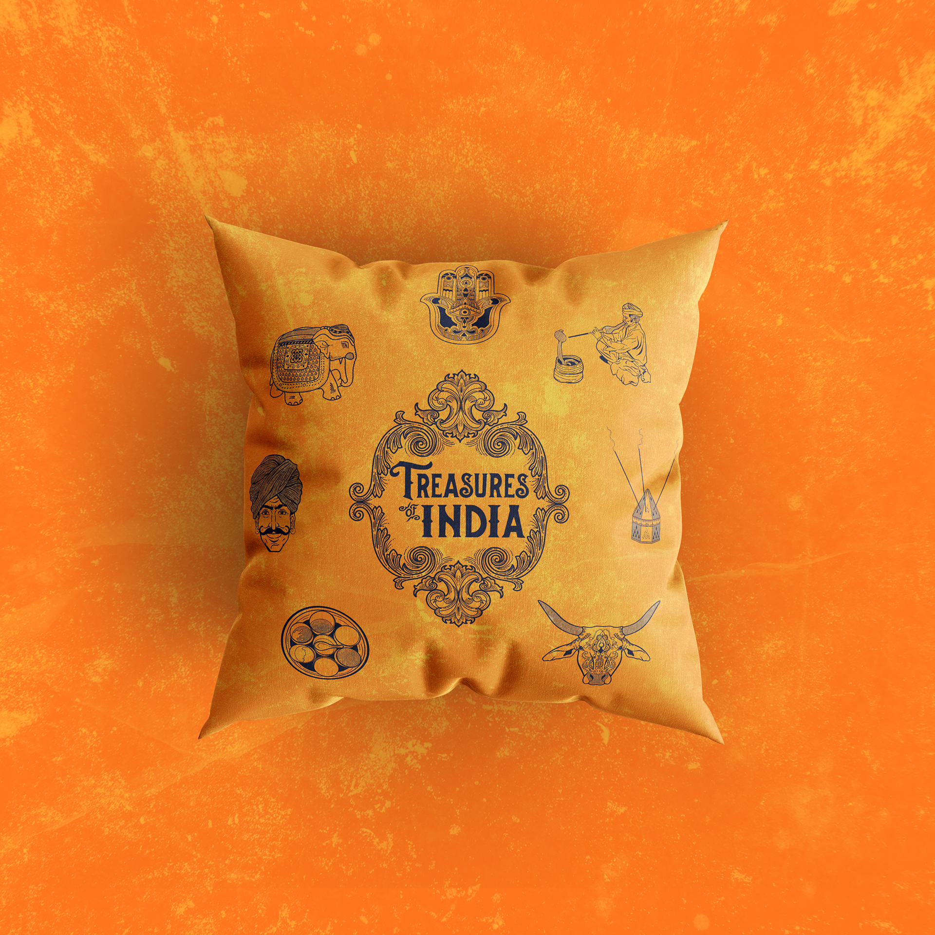
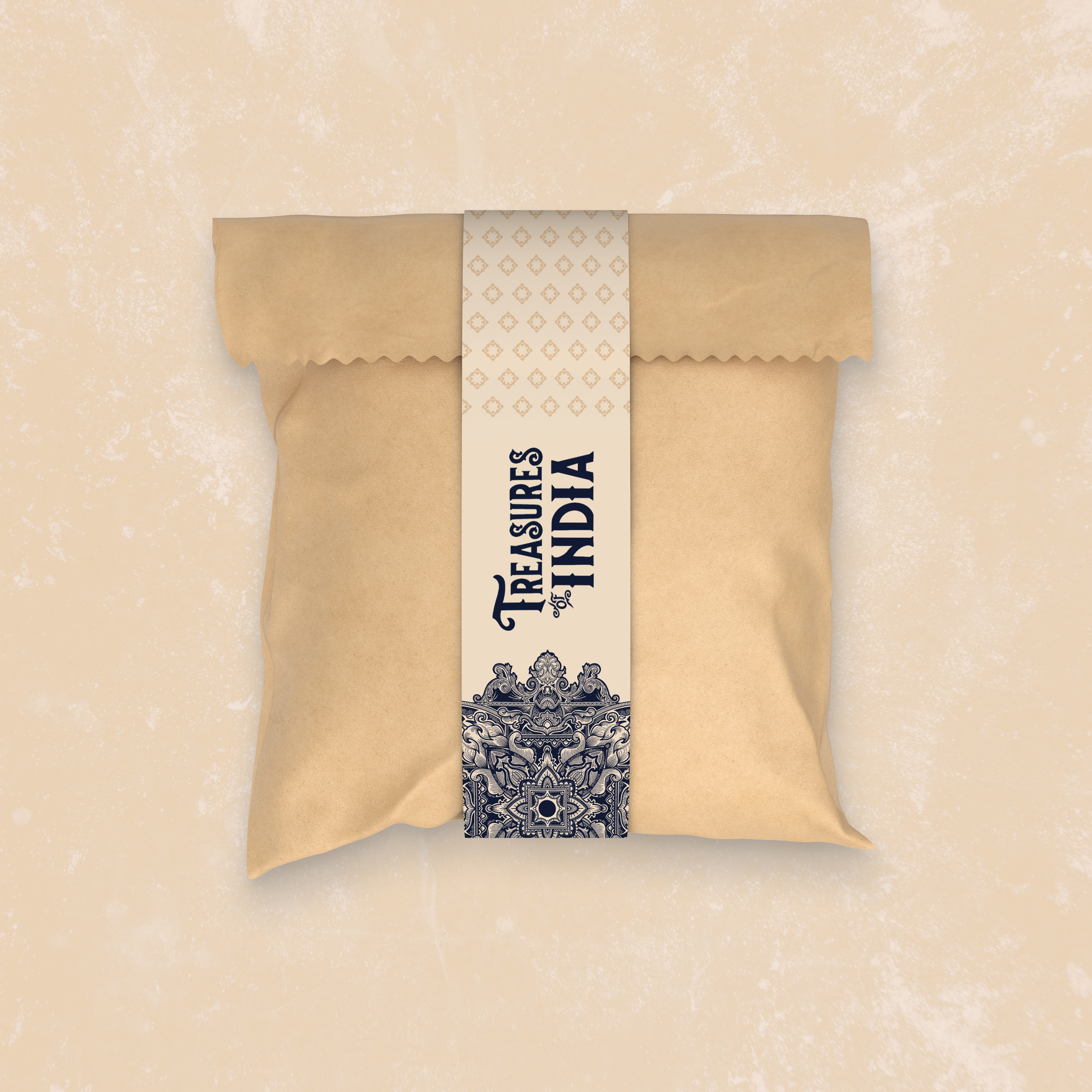
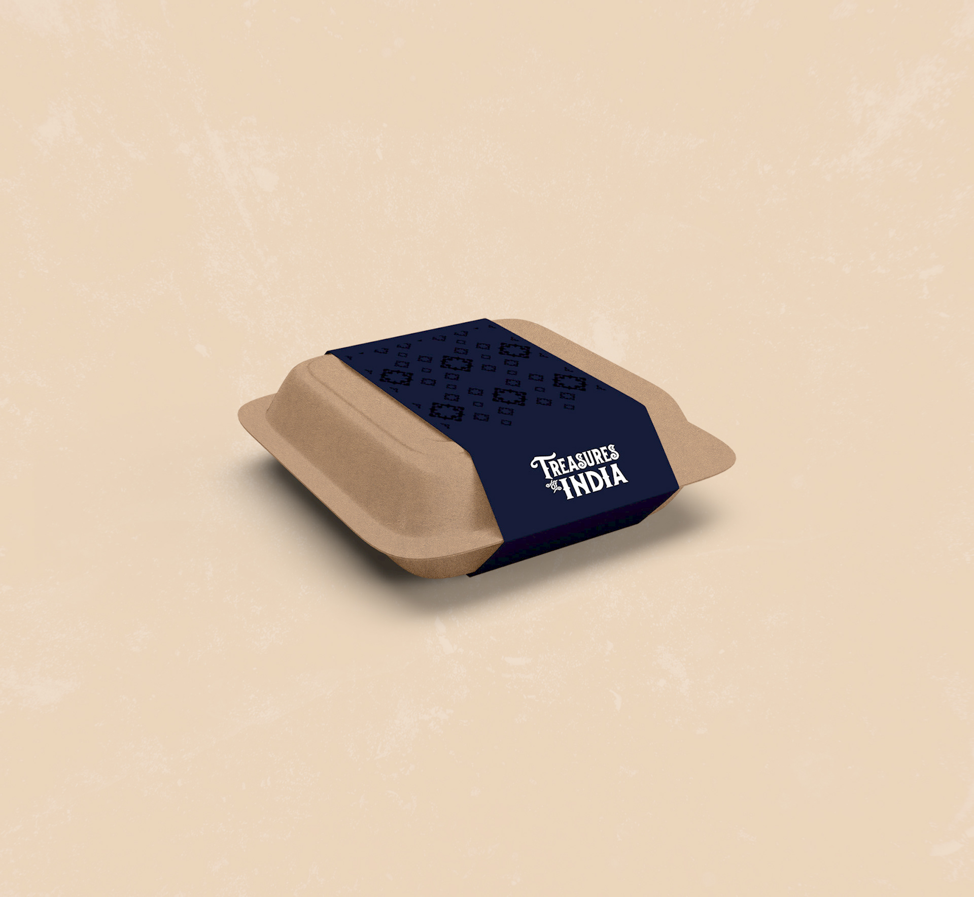
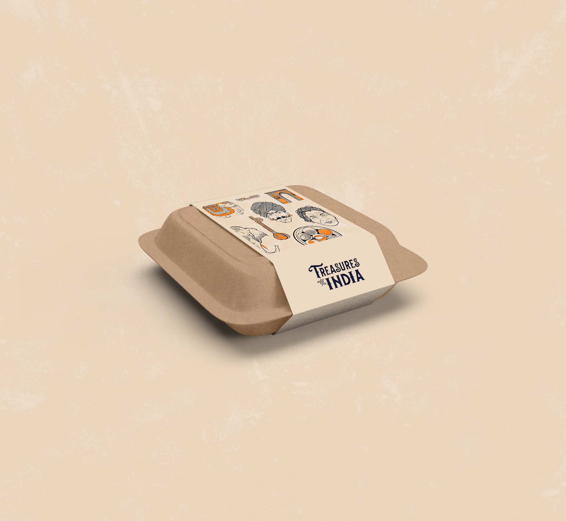
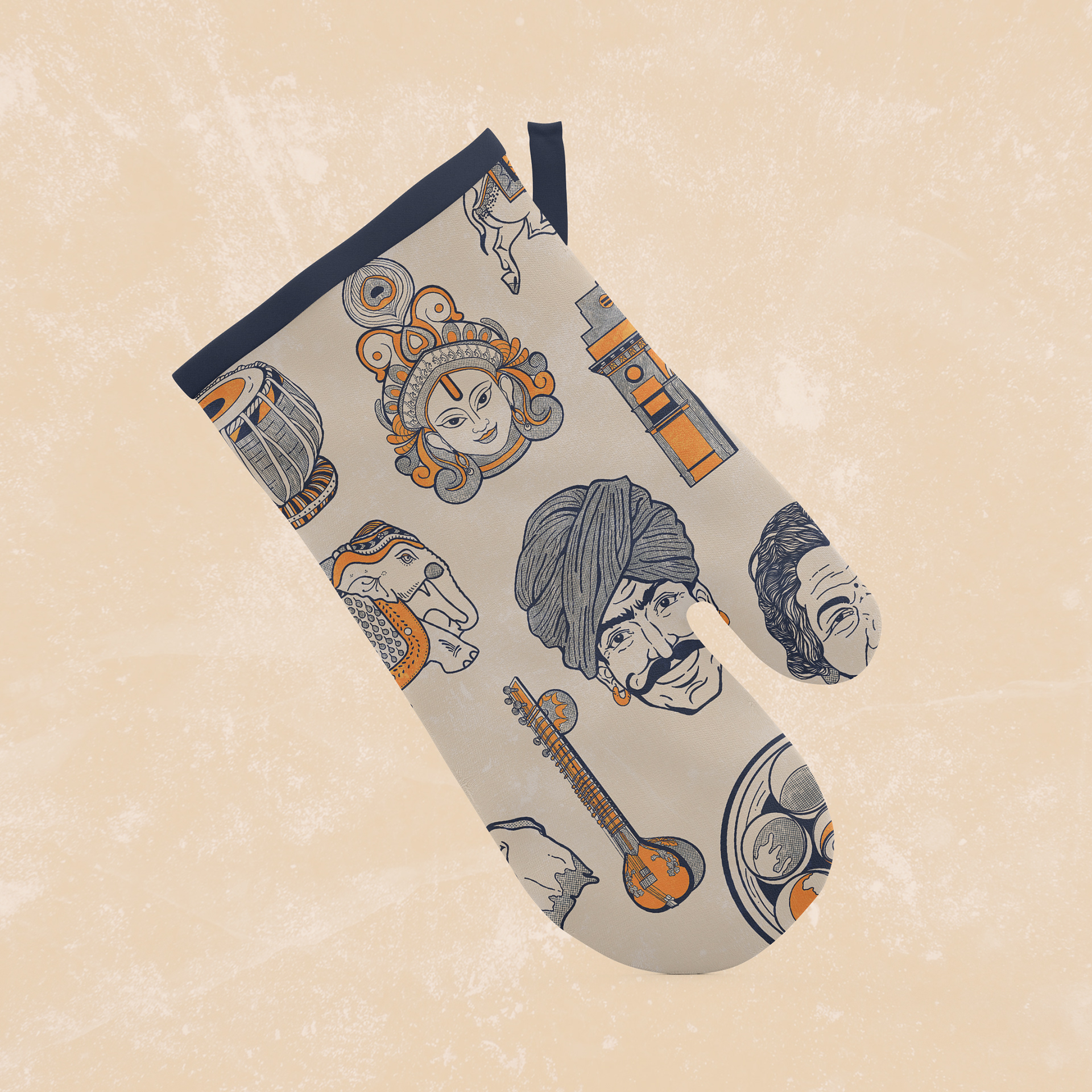
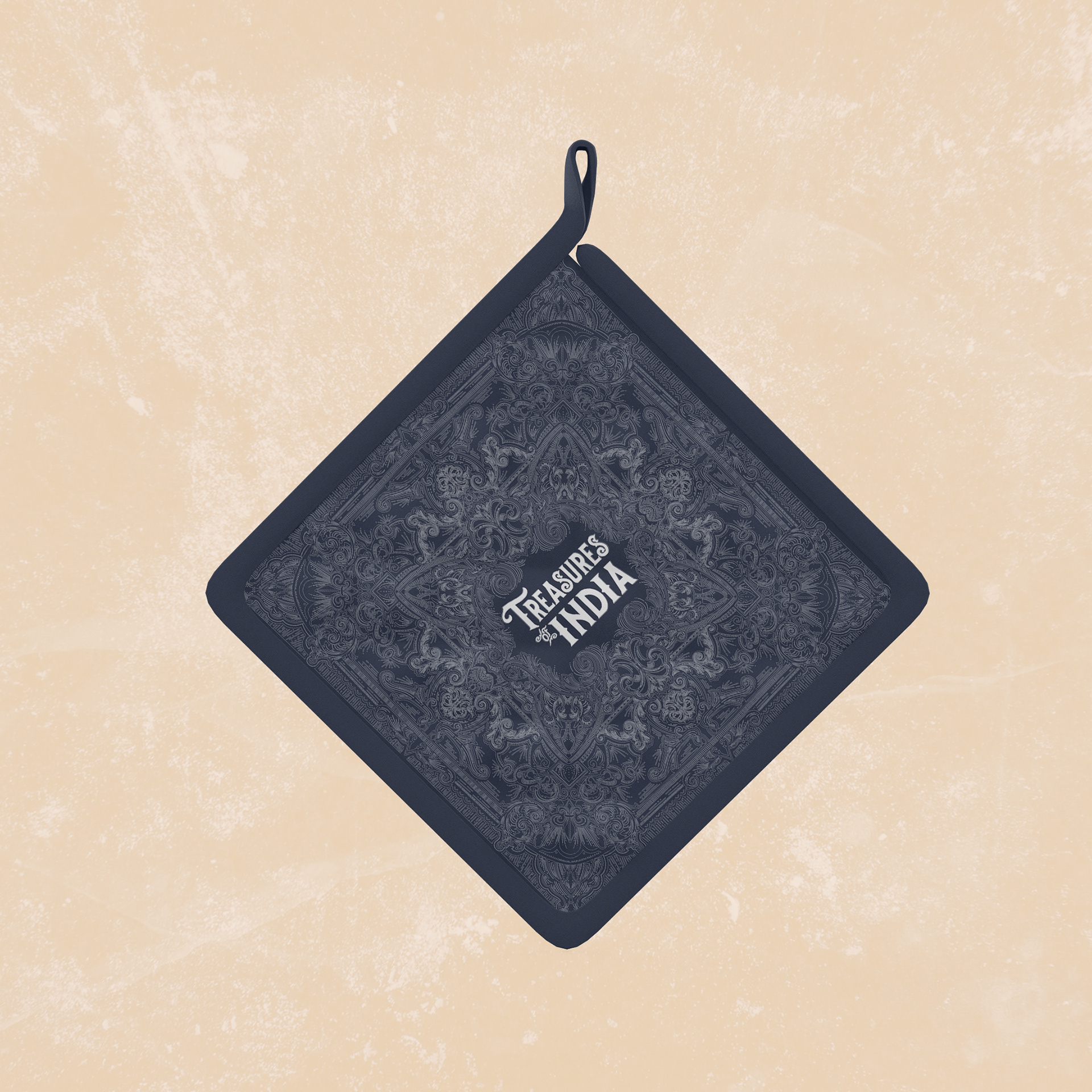
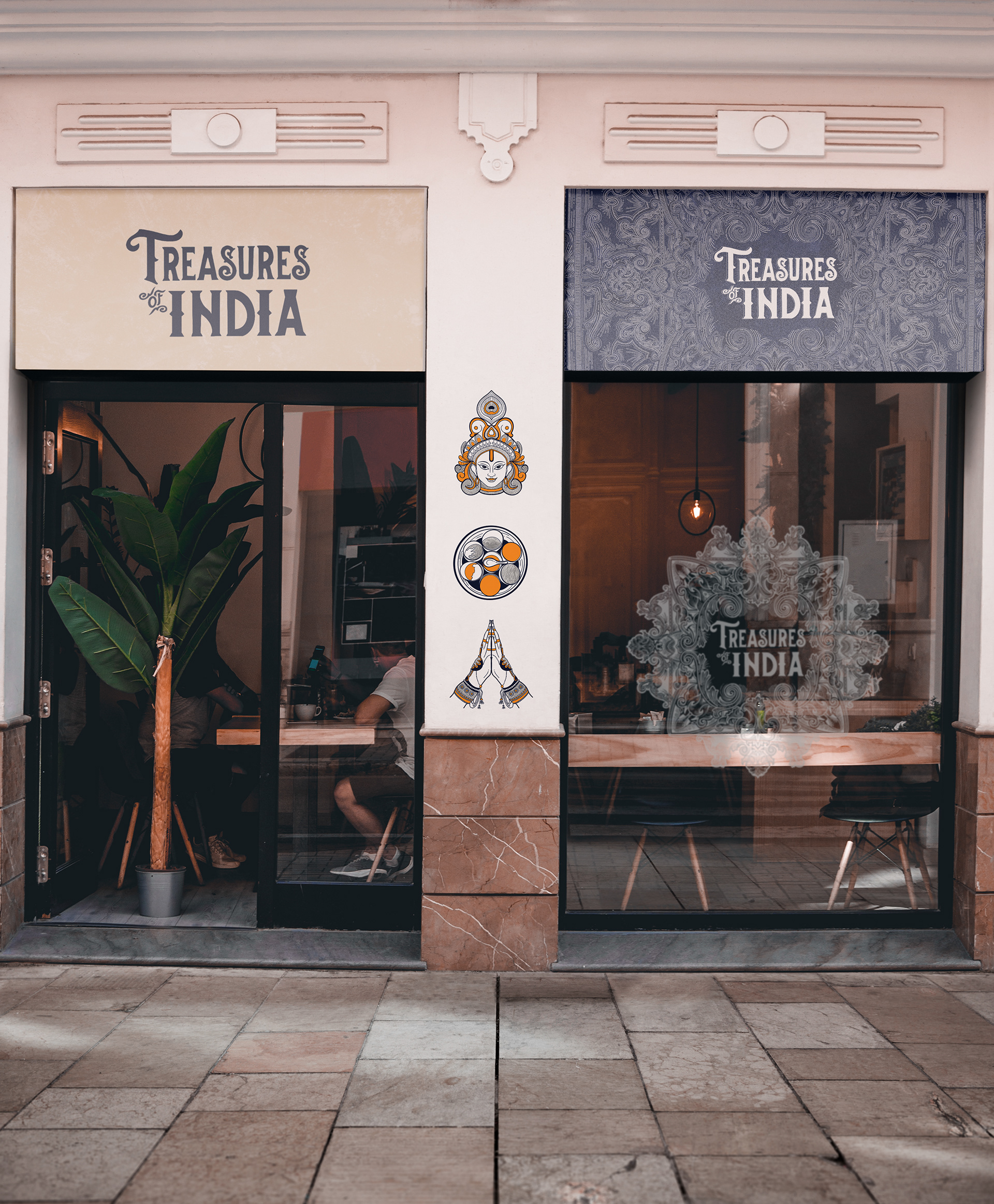
An identity system packed with hand drawn illustrations, incredibly detailed patterns and bold colour choices. The palette is inspired by the earthy red tones and spices found in the country paired with a bright turmeric orange against a deep royal blue.
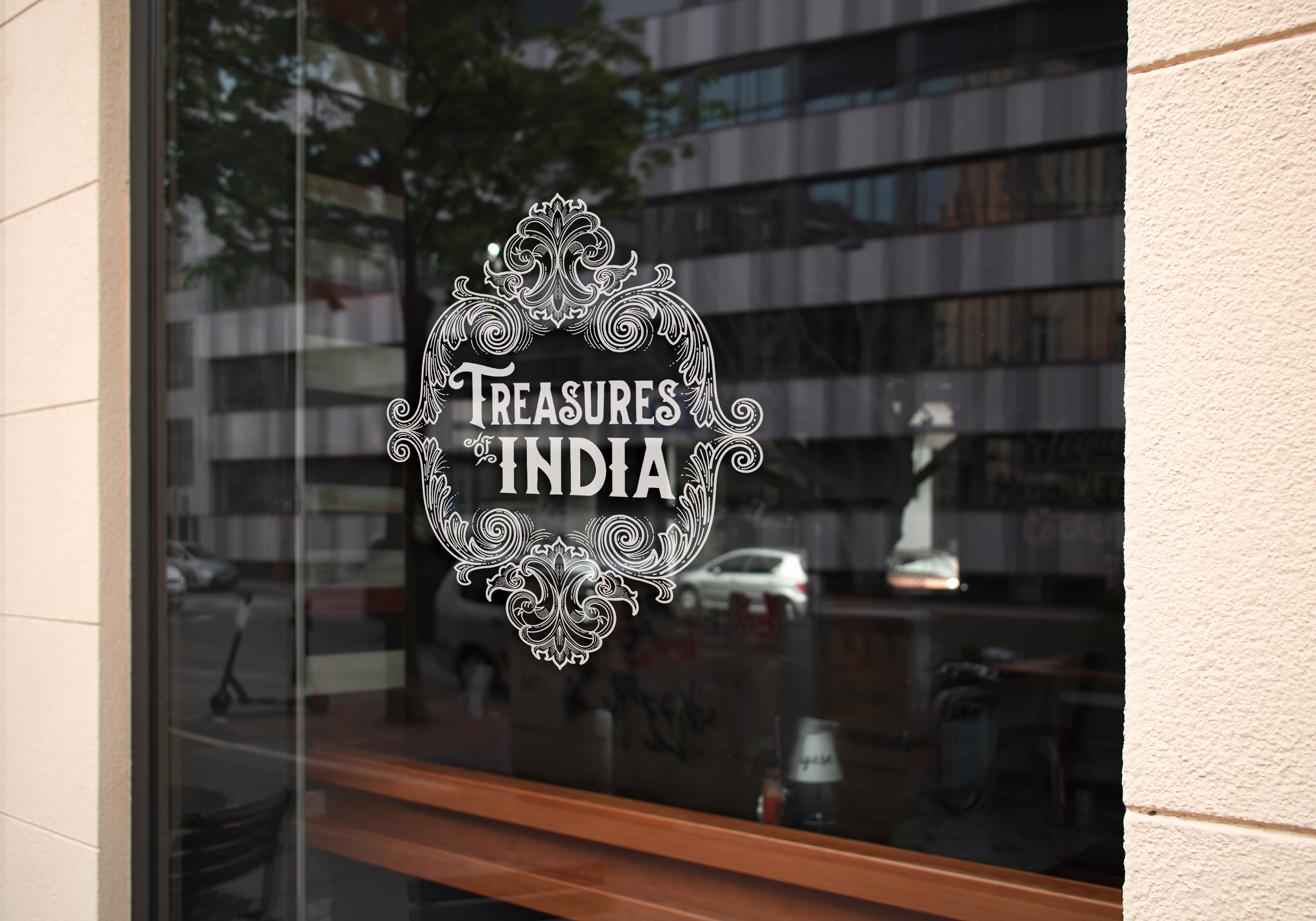
The goal was to capture the personality, diversity and beauty of the country using a stylised illustrative style paired with half tone textures. The hand drawn type found in the logo looks to give a sense of unique individuality and depict the style that is synonymous with the countries rich history - researching old texts and books to inspire the final type.
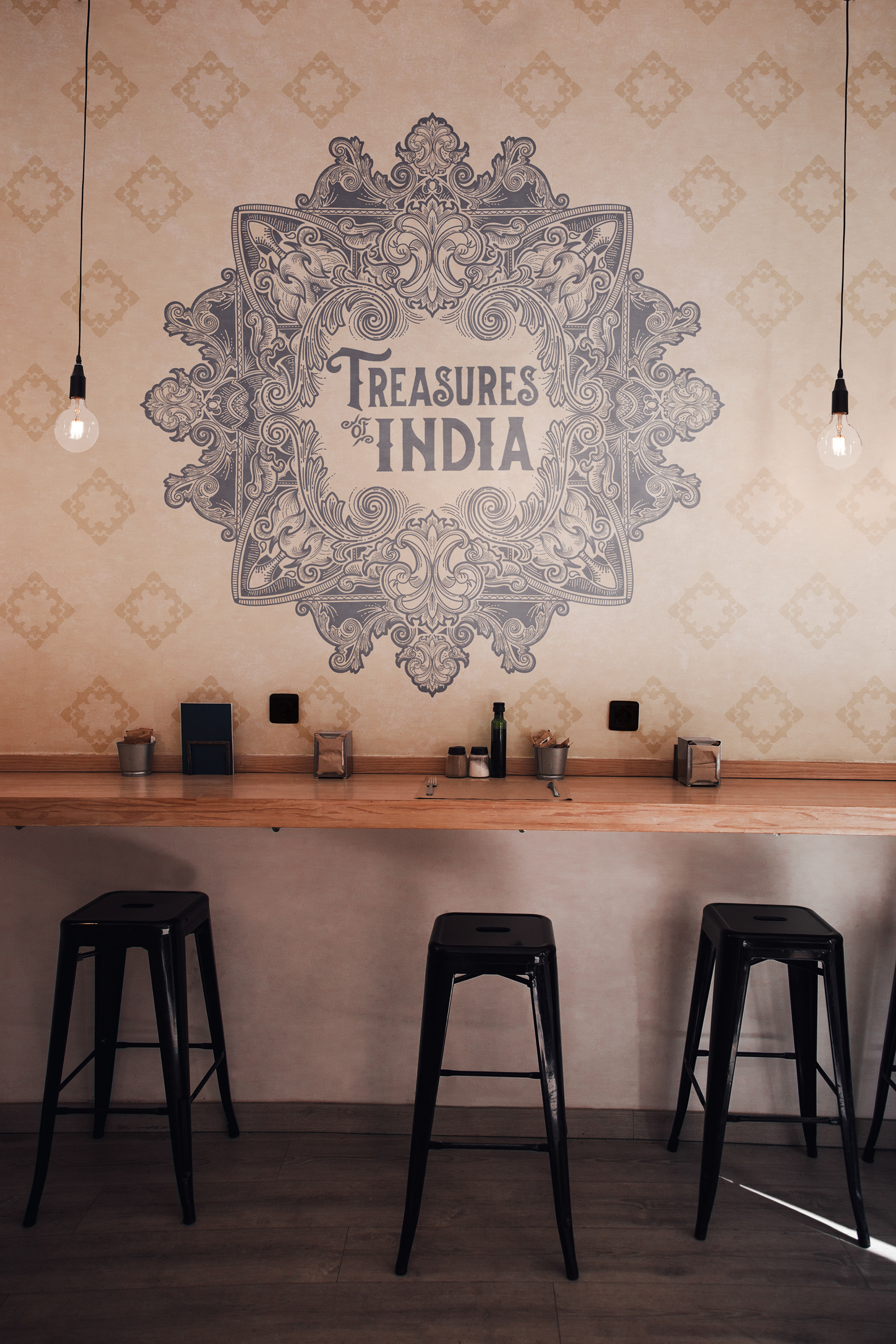
A dynamic identity system has been created where the logo builds up into a full pattern design. Each element can be extracted out and used in various ways, whilst coming back together as a unique design.
Why use illustrations in your brand?
Why use illustrations in your brand?
One of the most captivating ways to strengthen the visual language of a brand is to incorporate a well-curated illustration system. Illustrations can often express a feeling more distinctively than words alone.
Enjoy the full branding set below and you can follow @gunns_designs on instagram or contact me on linkedin for work.
