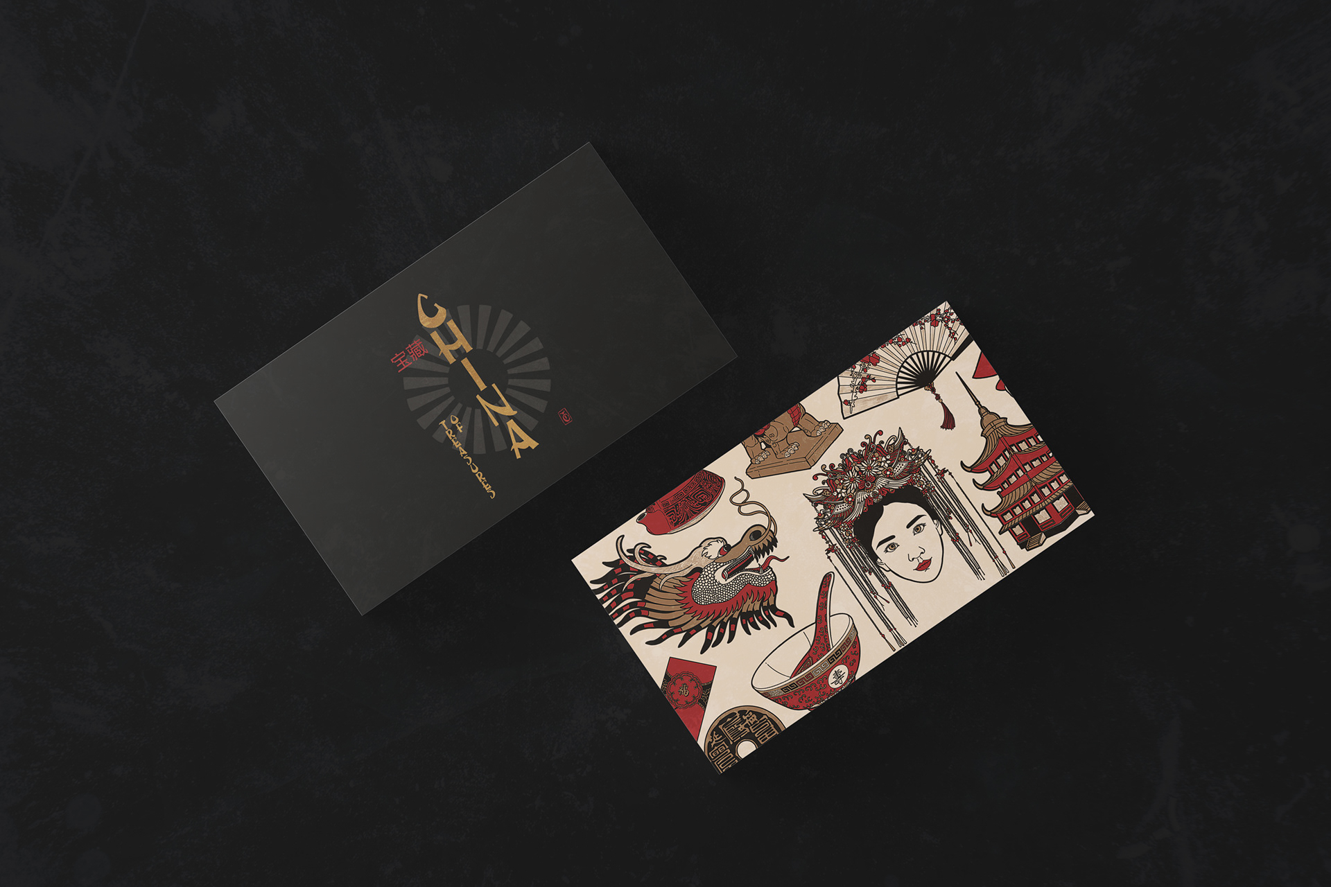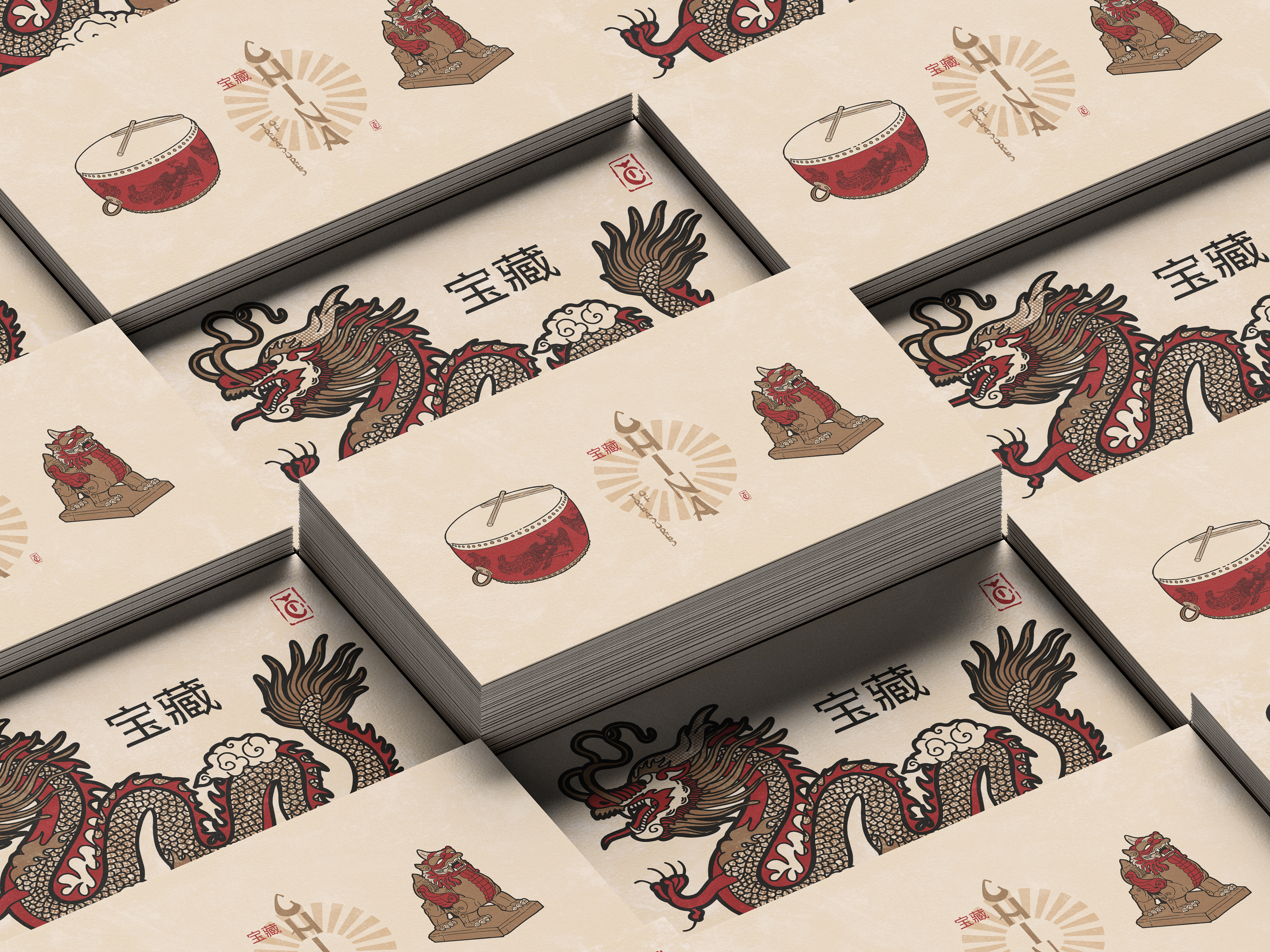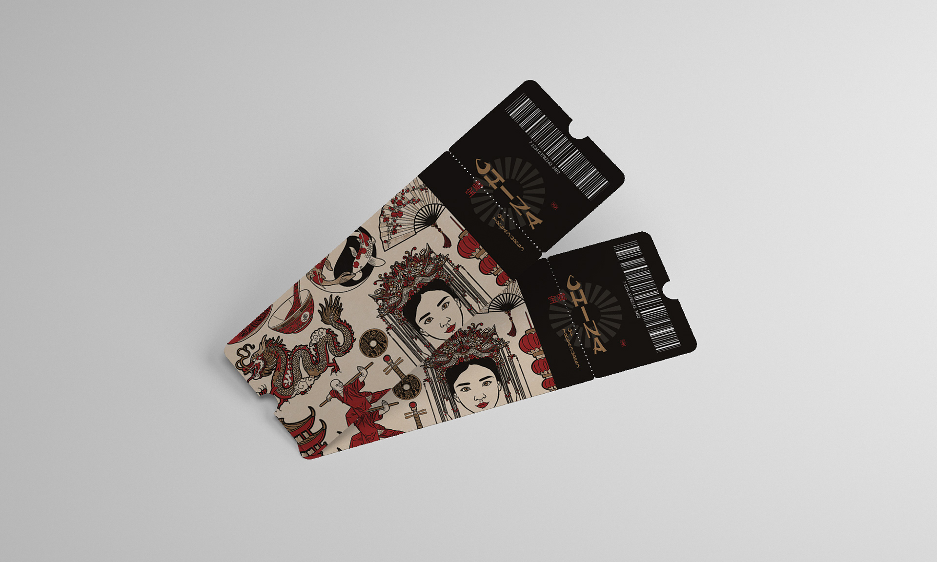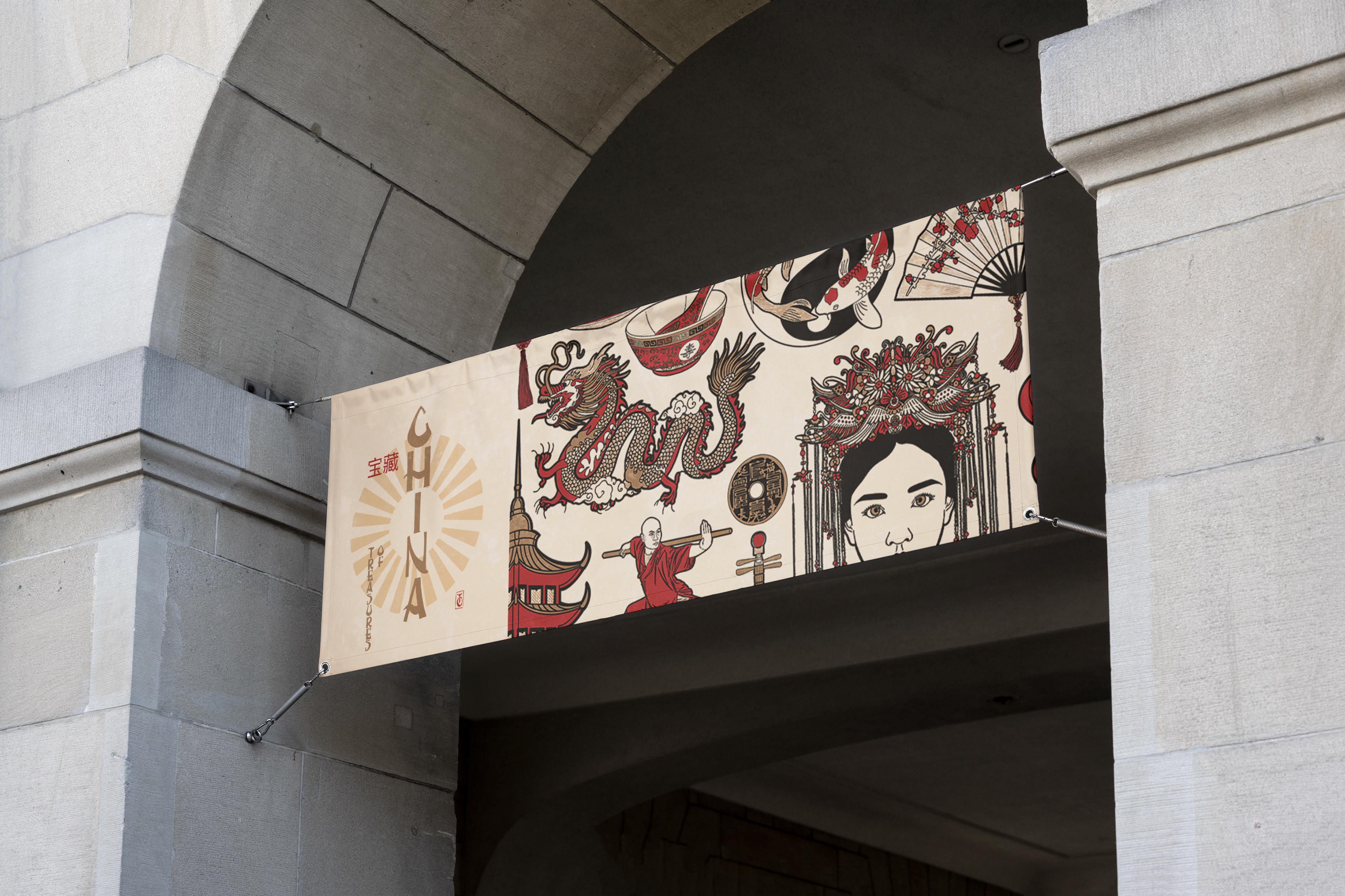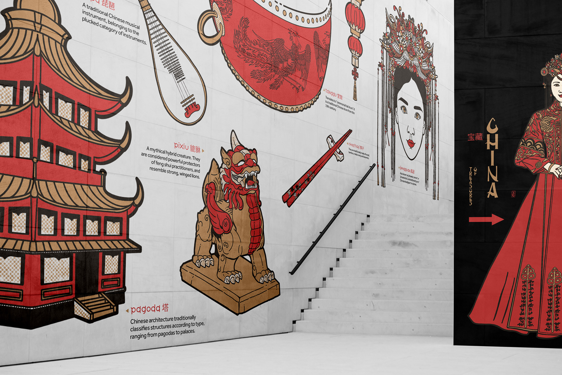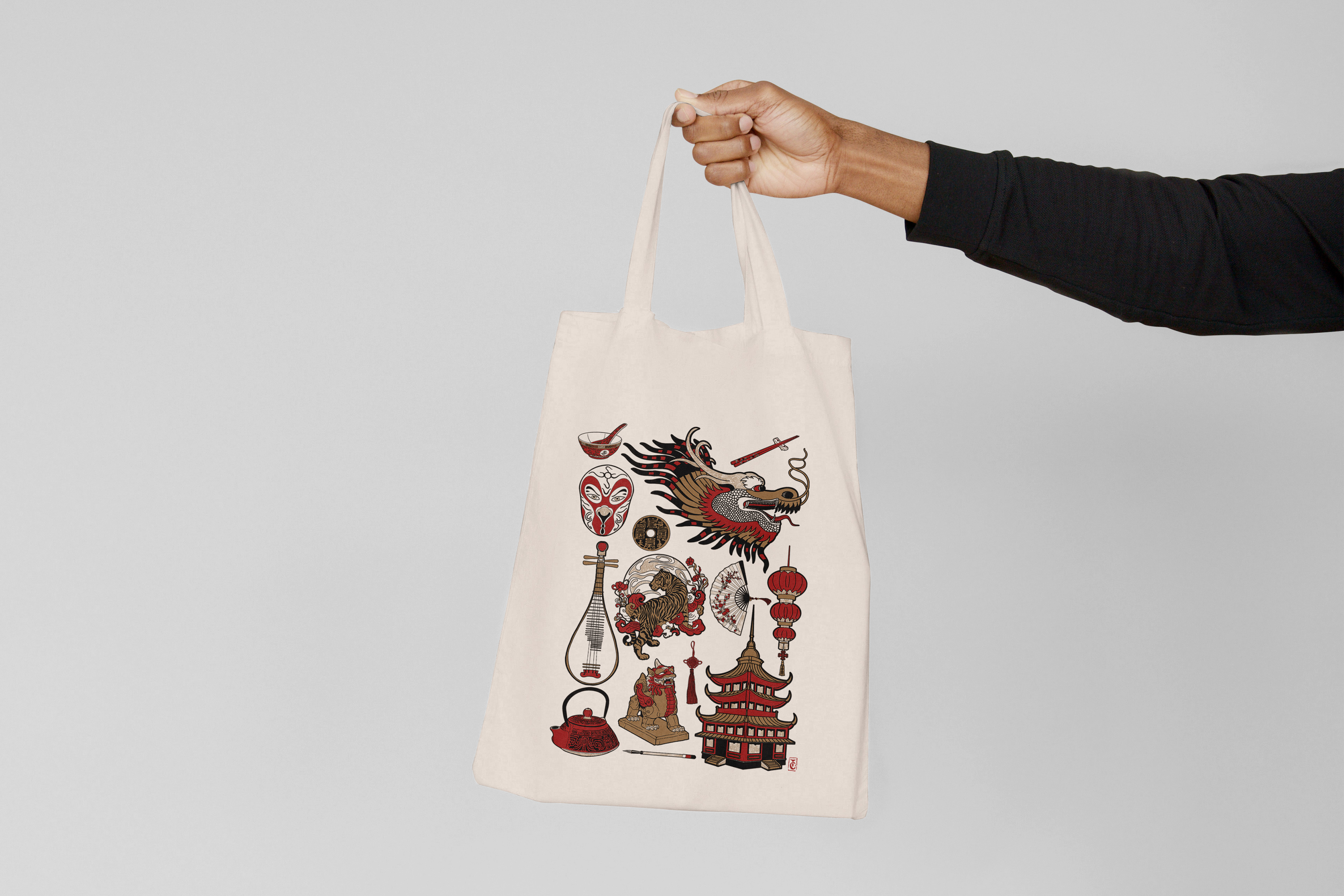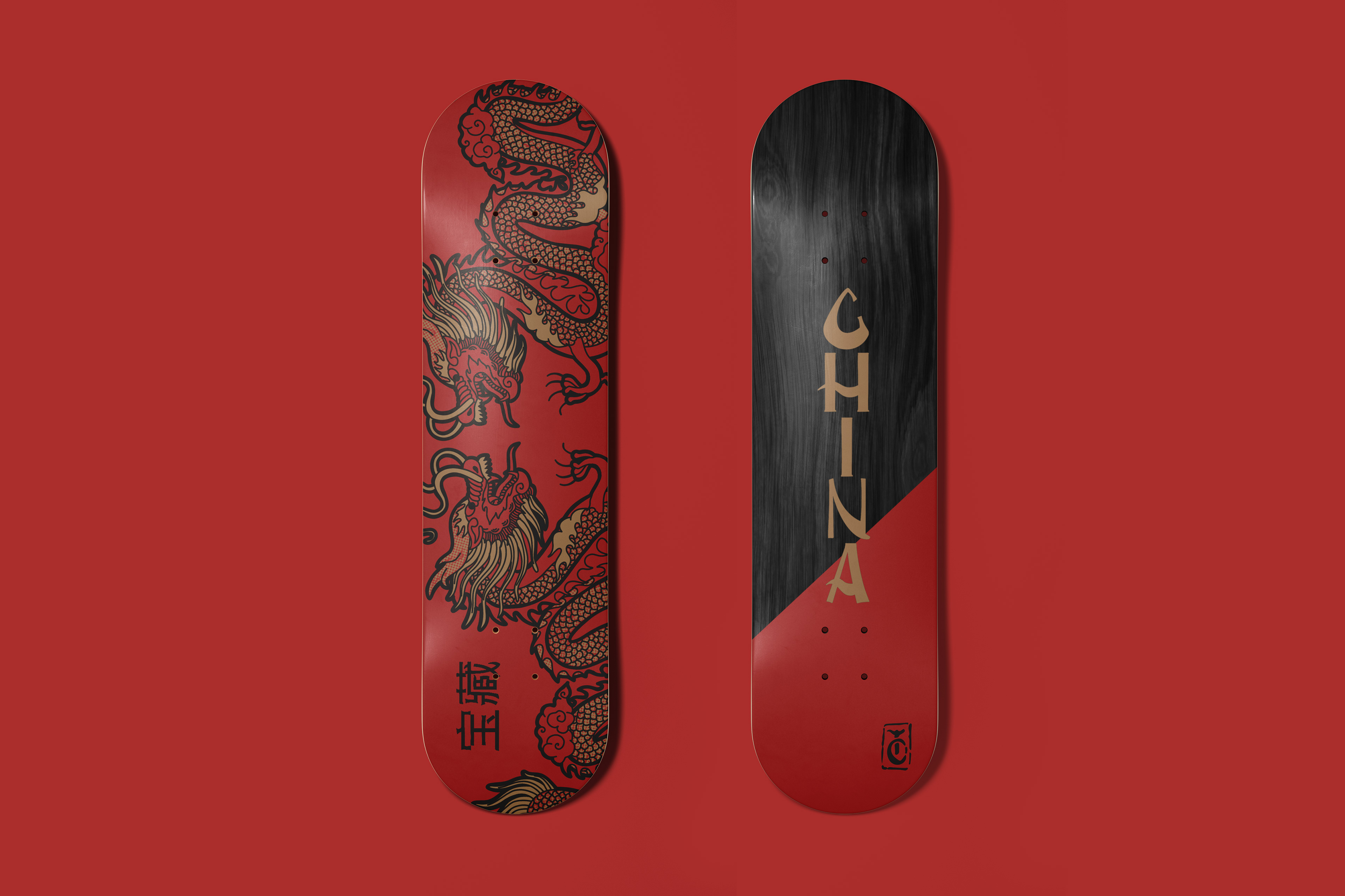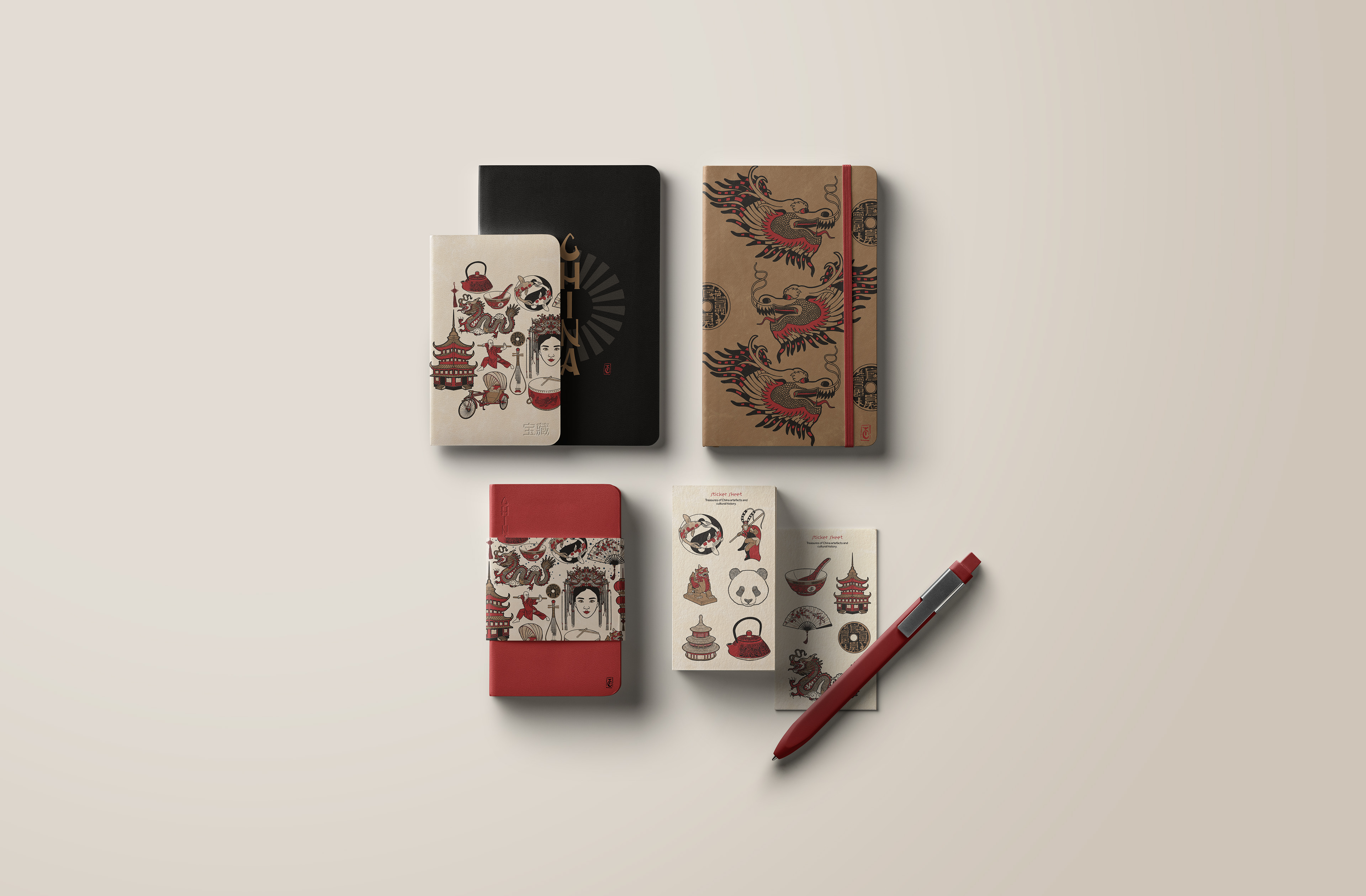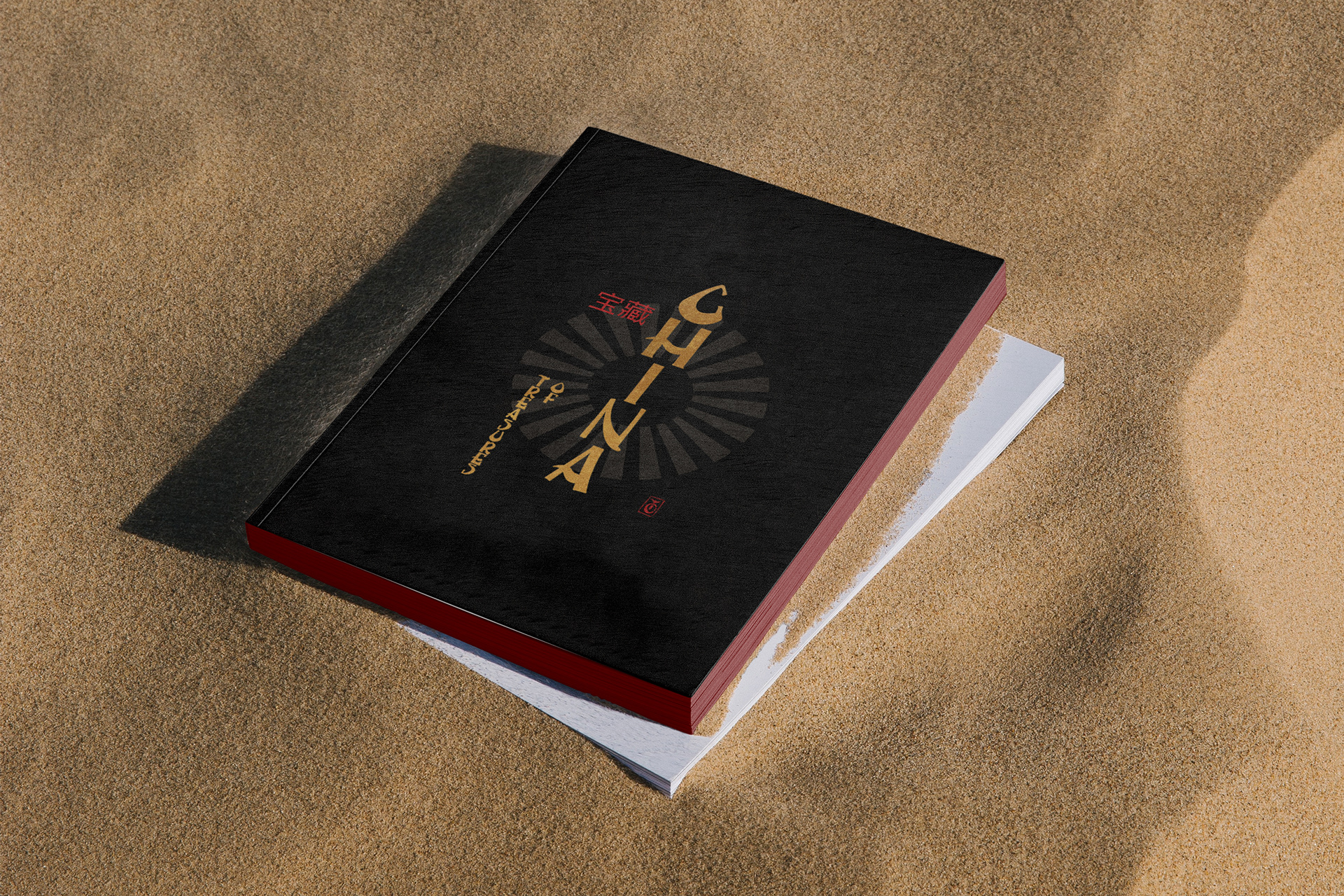
A celebration of the culture, history and treasures of China, as part of a wider project named 'Treasures'. Each illustration required research and then digitally hand drawn using a tablet, the brand identity looks to traditional Chinese design aesthetics; including vertical type, brush stroke accents on the letterforms, a monogram block stamp and iconic colours red, black and gold. The intention was to use the illustrations to give an identity to an exhibition showing collections from China.
Various collateral has been considered including tickets, wall art, banners and gift shop items.
Why use illustrations in your brand?
One of the most captivating ways to strengthen the visual language of a brand is to incorporate a well-curated illustration system. Illustrations can often express a feeling more distinctively than words alone.
One of the most captivating ways to strengthen the visual language of a brand is to incorporate a well-curated illustration system. Illustrations can often express a feeling more distinctively than words alone.
Enjoy the full illustration set below and follow @gunns_designs on instagram or contact me on linkedin for work.