The Client
Harlow Academy is a family of academies within the South of England with a shared ethos, common values and collective goals. Our Academies have a simple priority, to deliver outstanding teaching and learning for all.
Harlow Academy is committed to delivering a high-quality educational experience for all its students; it is also committed to sharing its experience and expertise with other educational institutions to raise attainment for all students.
The mission of Harlow Academy is to prepare young people to play an active part in a technologically mature society by providing them with the exceptionally high level skills, qualifications and attitudes that will benefit themselves and the wider community in an internationally competitive world.
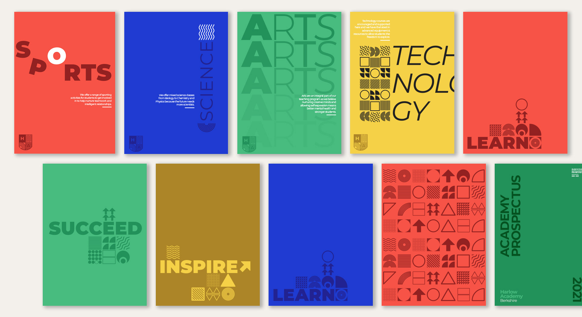
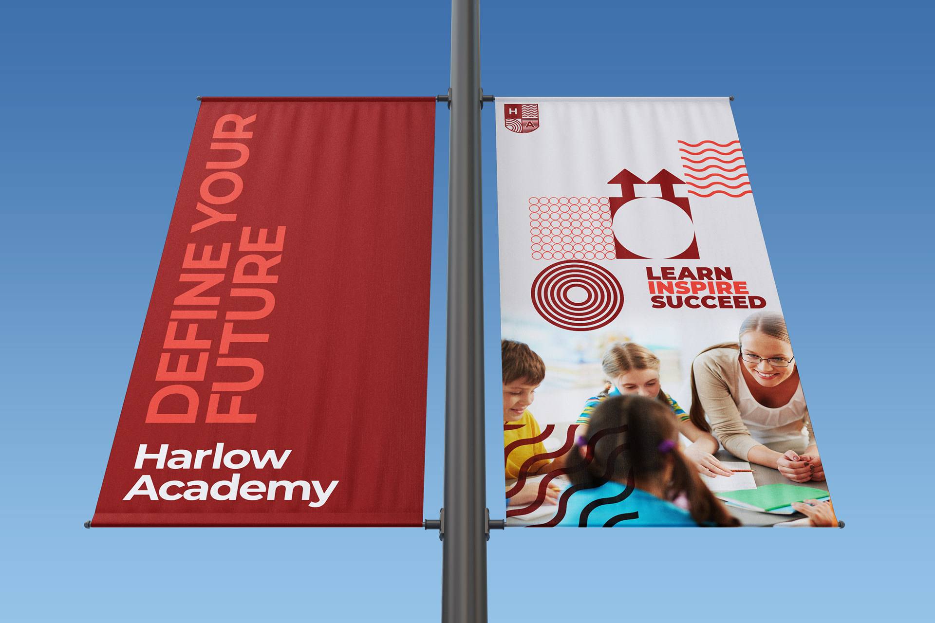
Our mantra of: 'Learn, Inspire, Succeed' helps our students forward in all areas of life and is upheld in all aspects of teaching we provide.
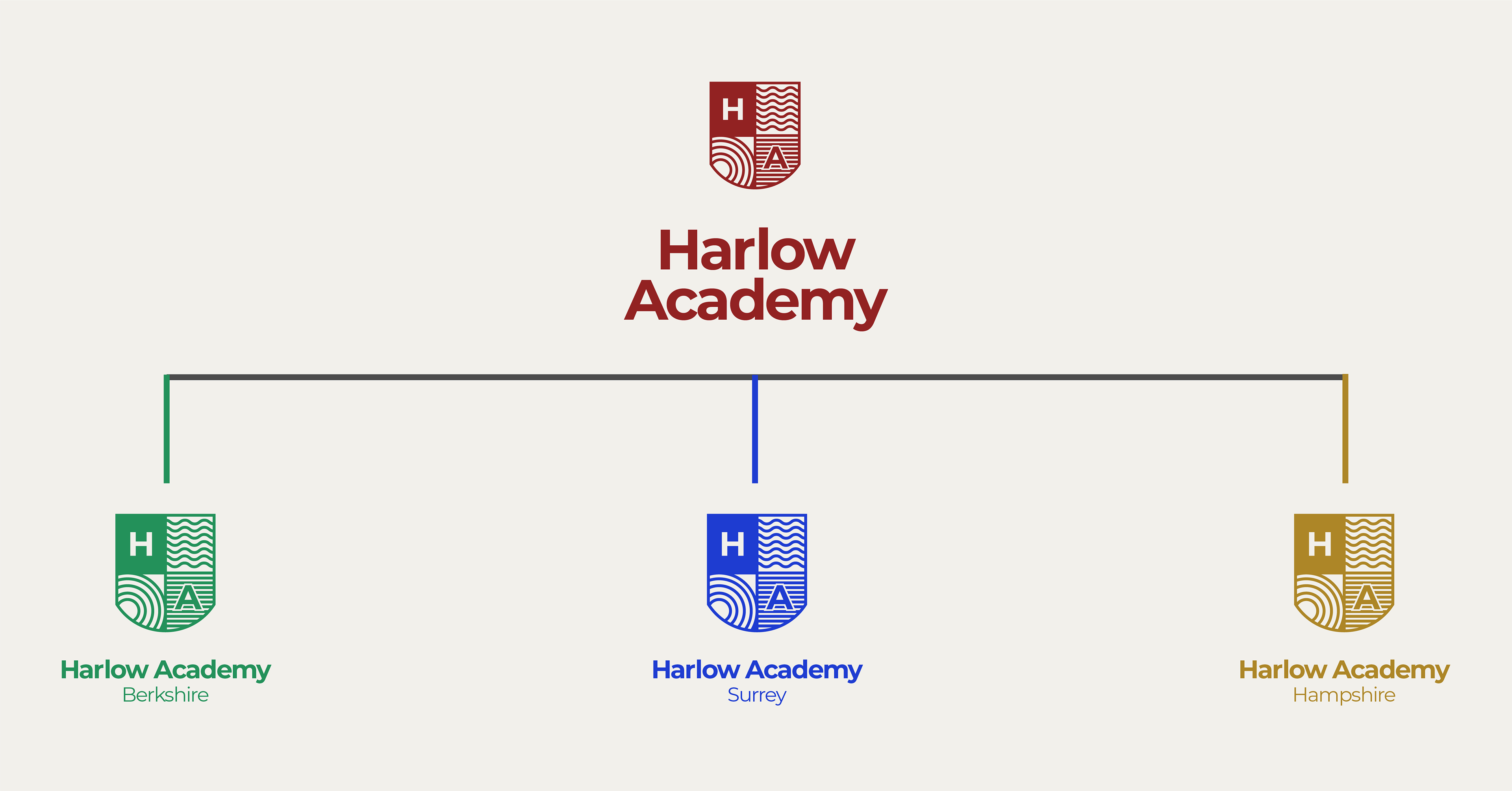
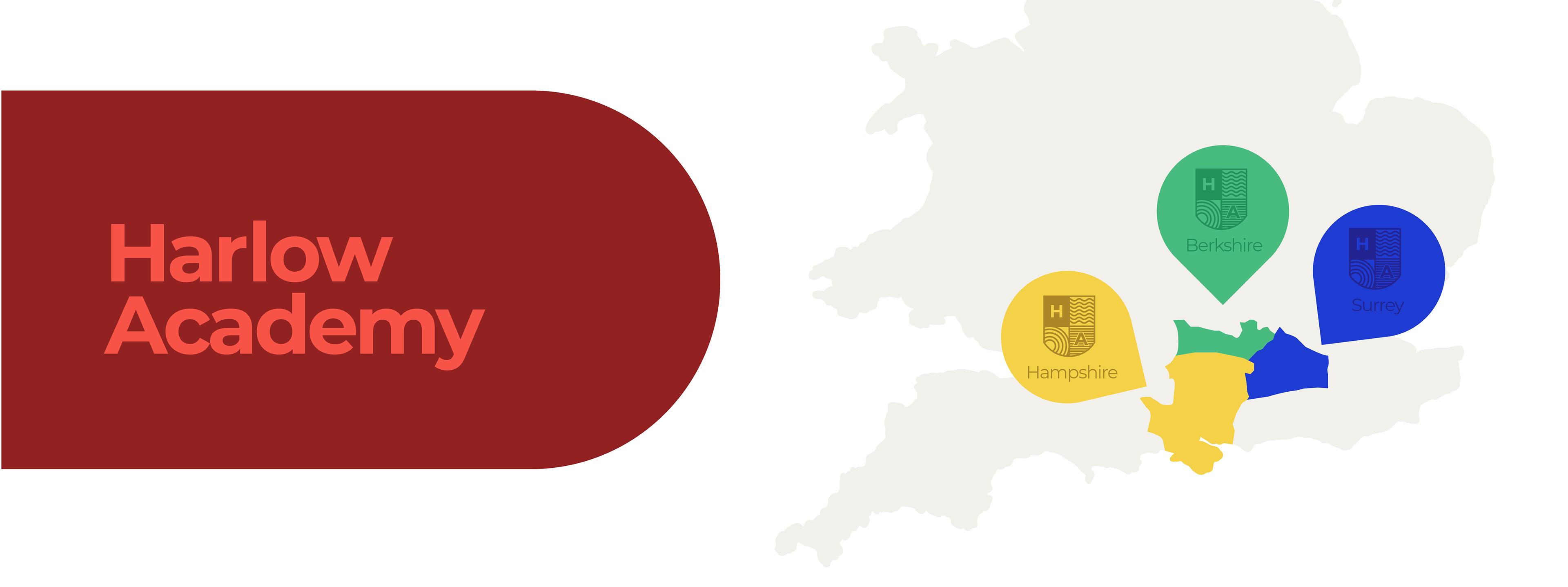
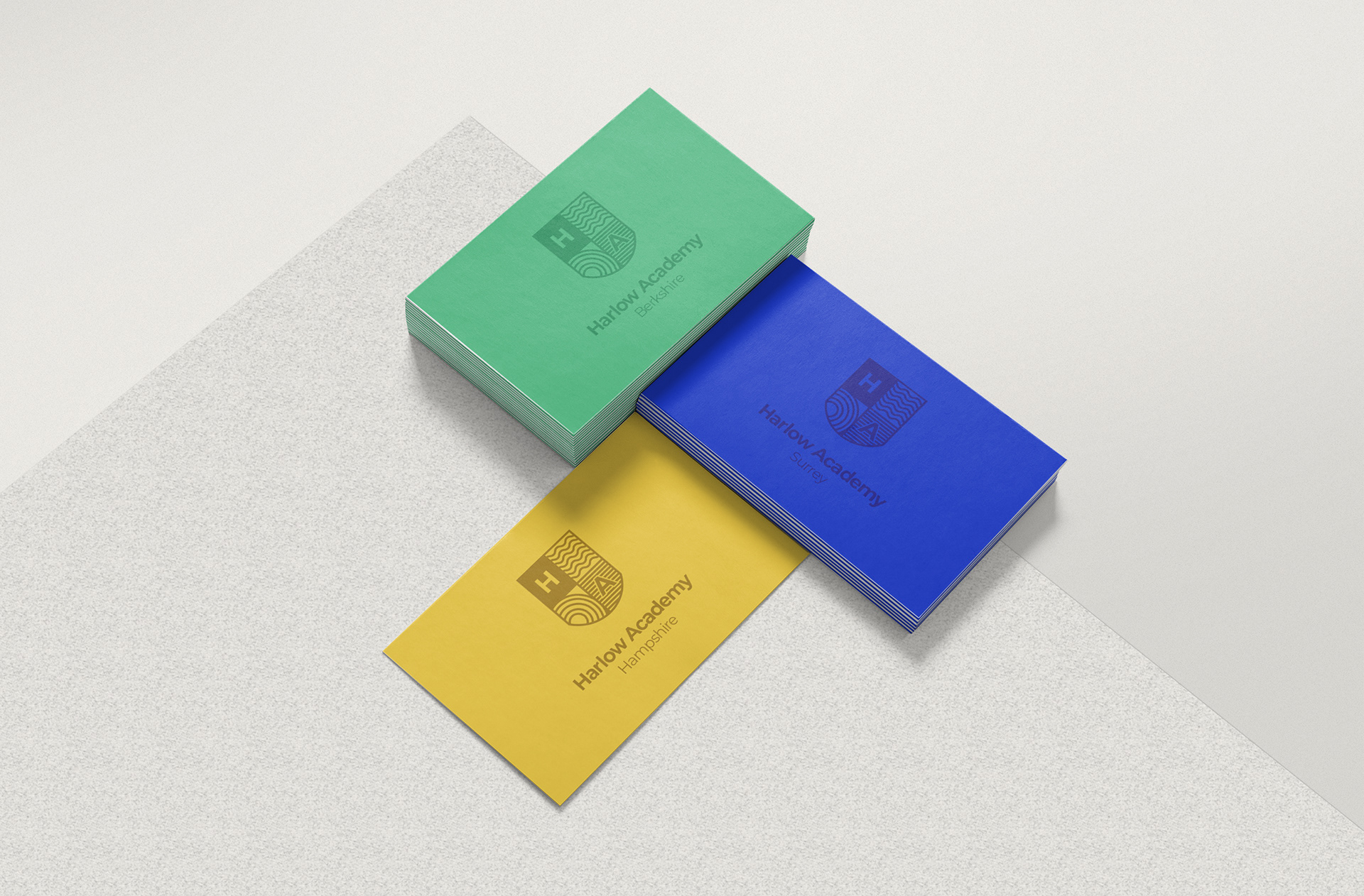
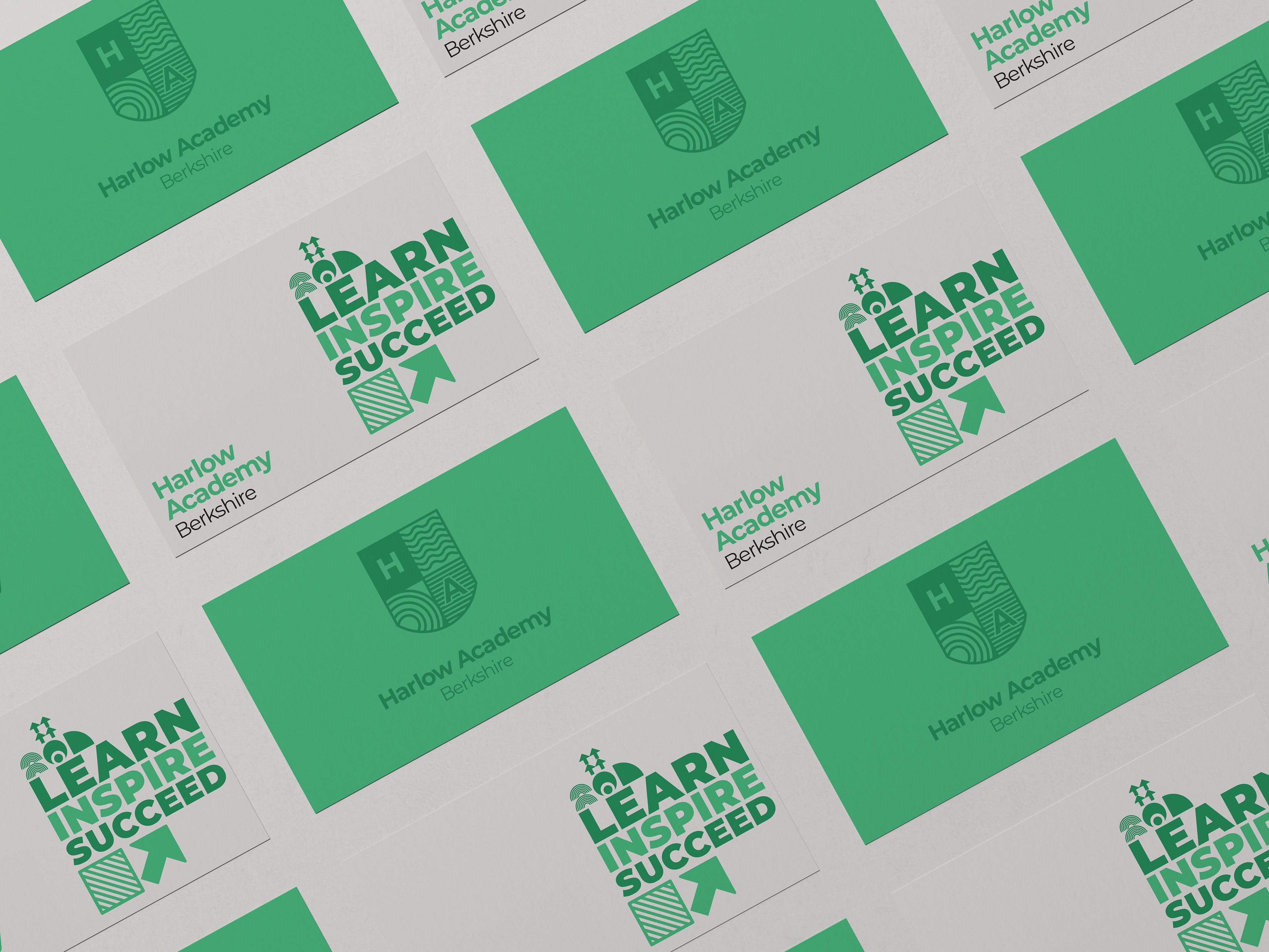
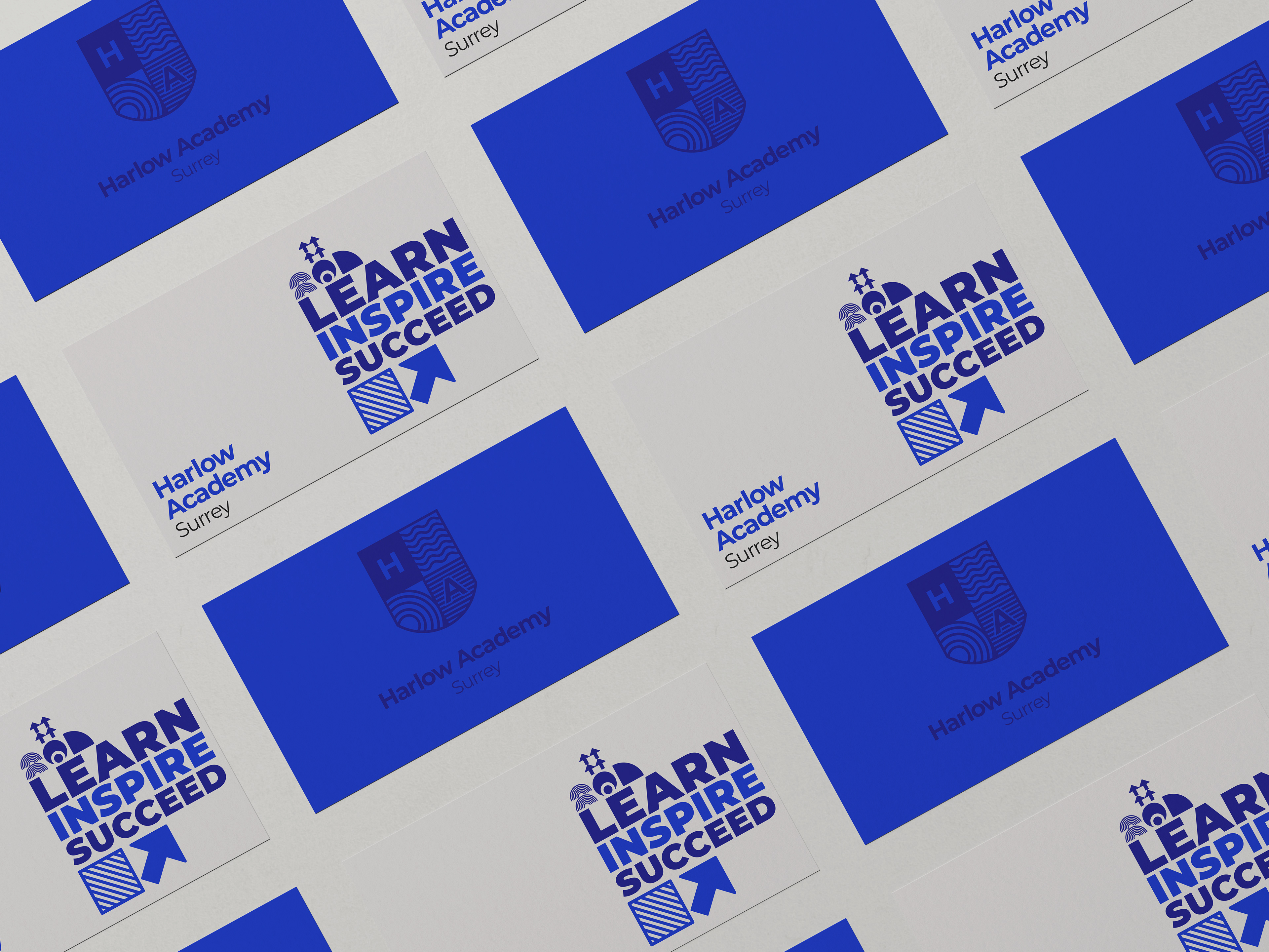
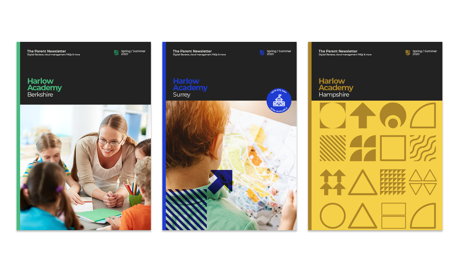
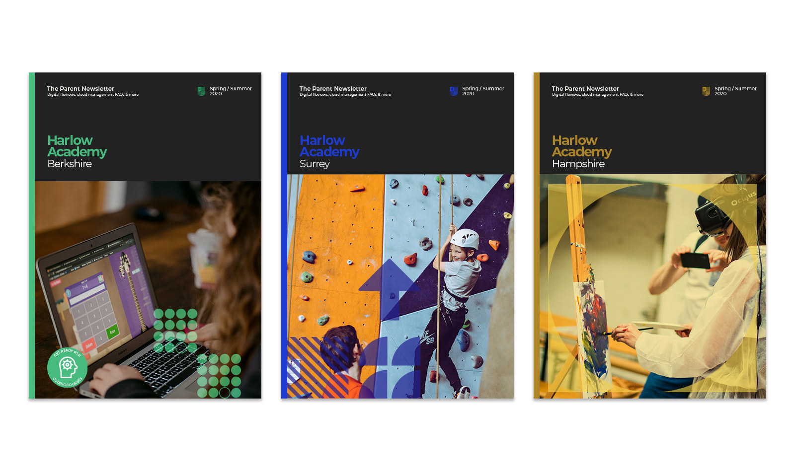
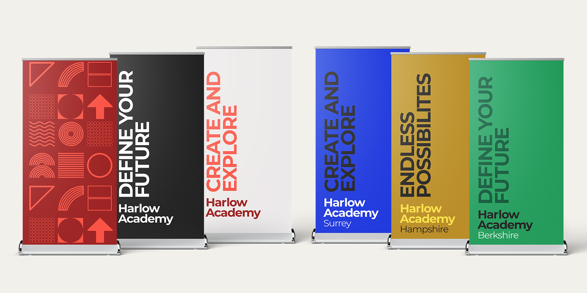
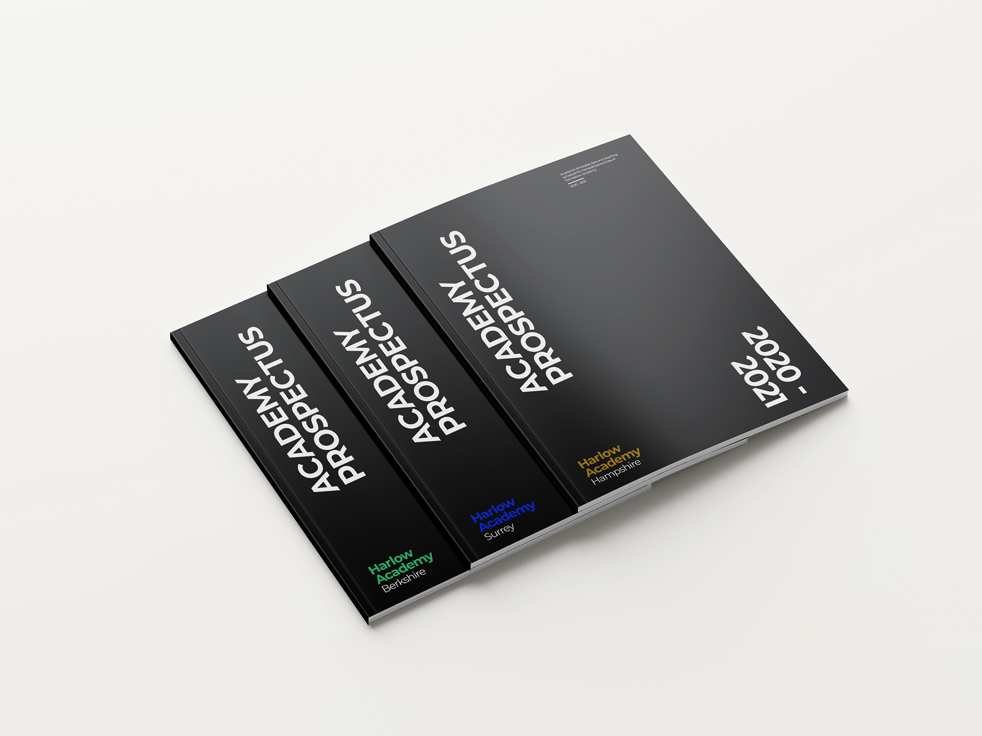
We currently have 3 counties with academies and will be looking to expand into new areas and bring our teaching vision to more students across the UK.
The Brief
The academy needed a cohesive brand to use across their entire network of schools. It needed to be dynamic & flexible enough to be used across a wide range of applications from brochures to digital interface curriculums. The schools needed to work as individual schools but come together as one.
Academy schools are increasing in popularity over mainstream state schools due to their fresh and forward thinking delivery of new curriculums and learning resources. The school has partnered with a cloud based teaching software that utilises interactive learning and an all in one digital teaching solution. The brand needed to fit in with this modern approach and be easily applied to digital areas of the teaching applications.
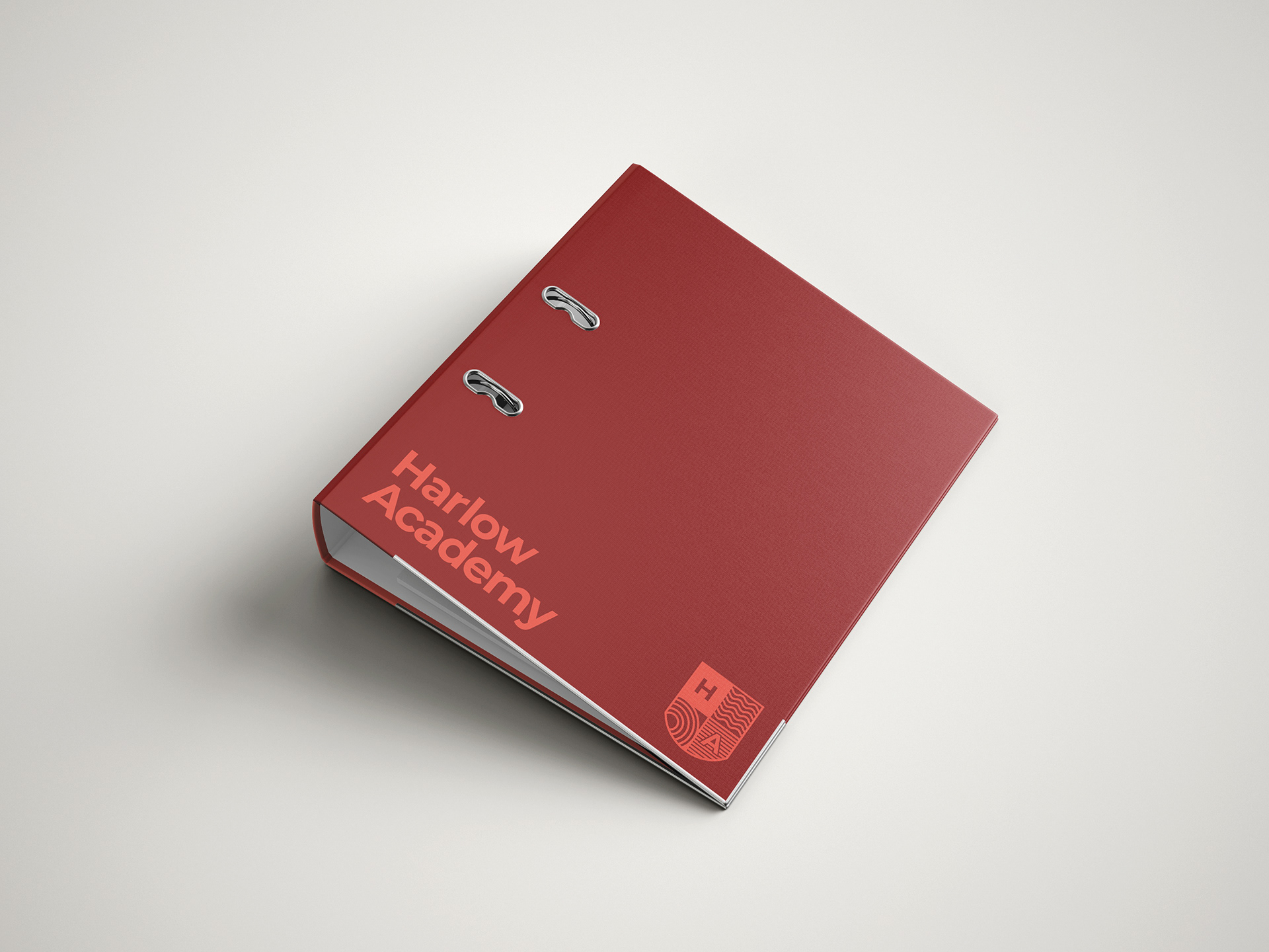
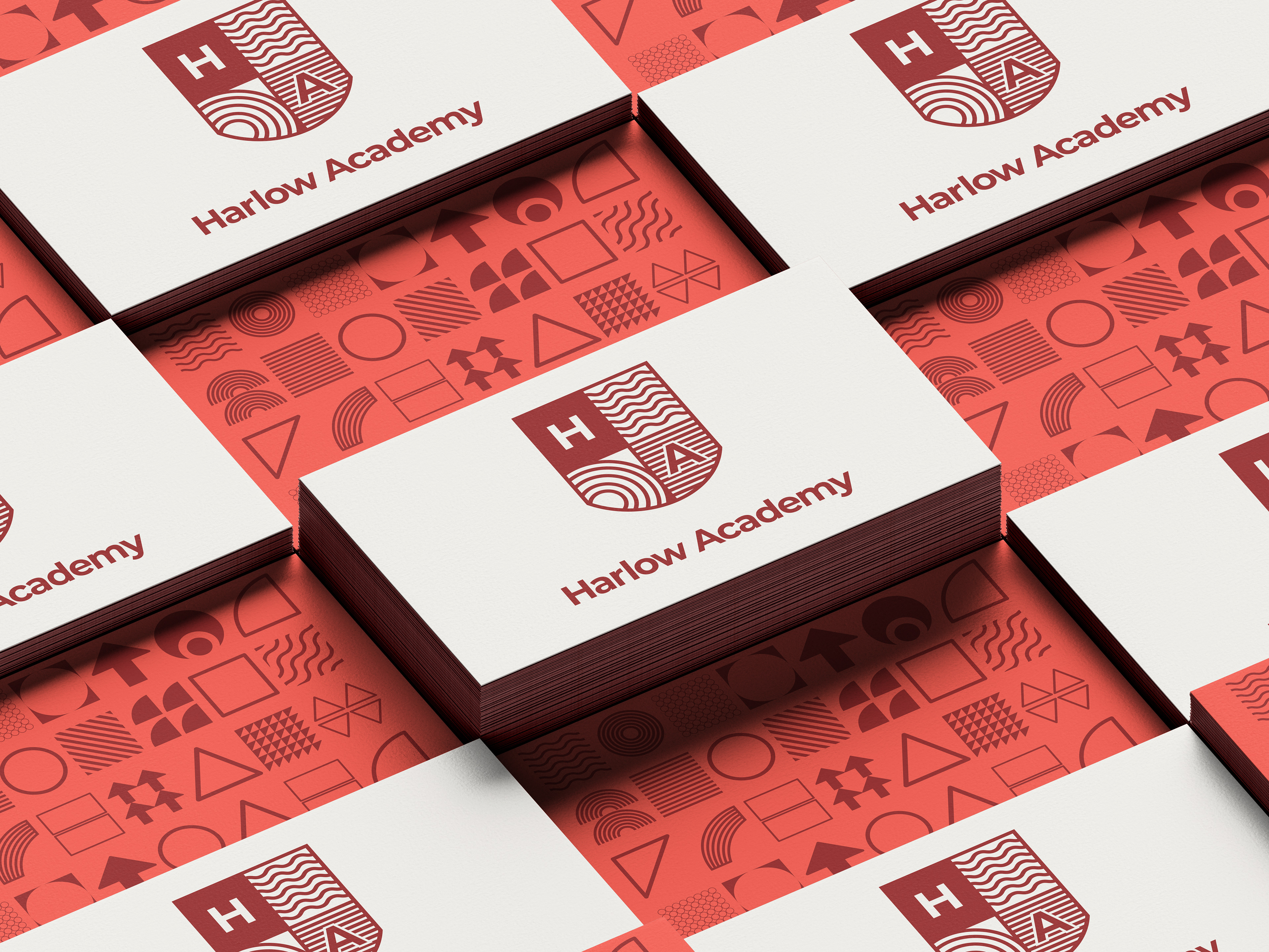
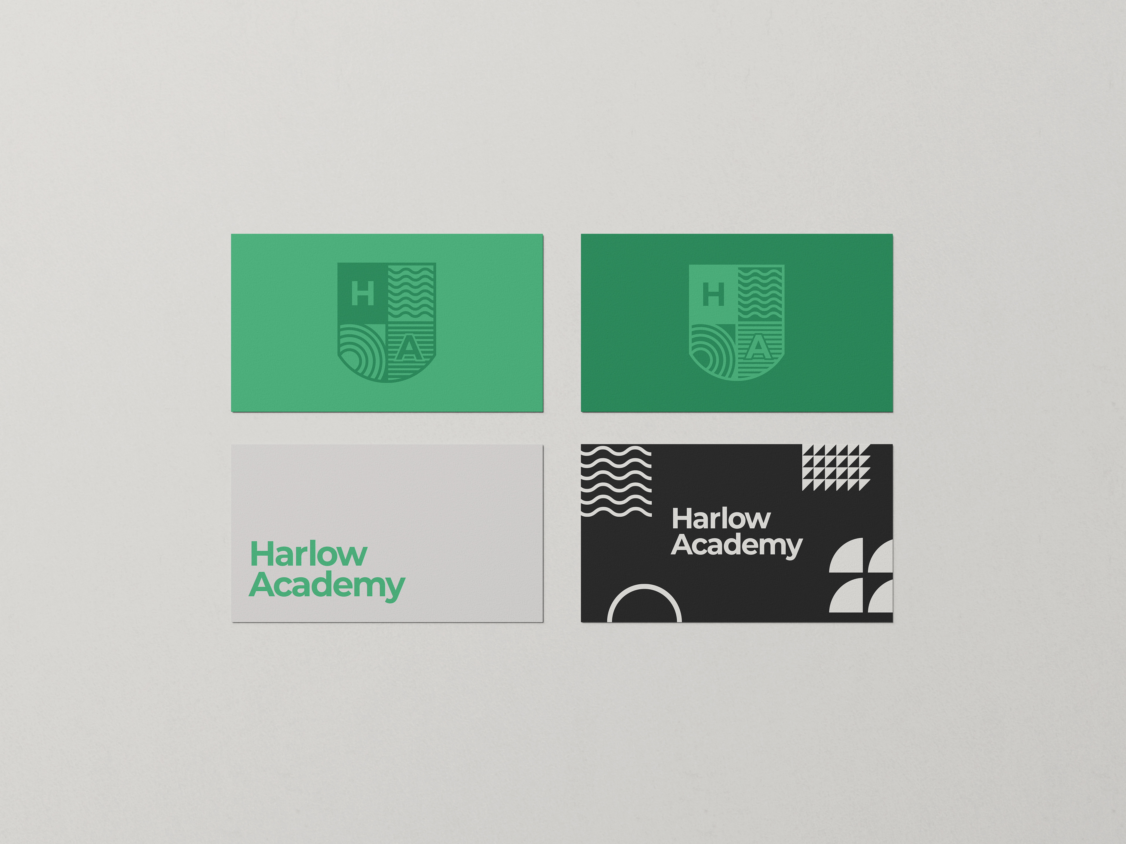
The Brand
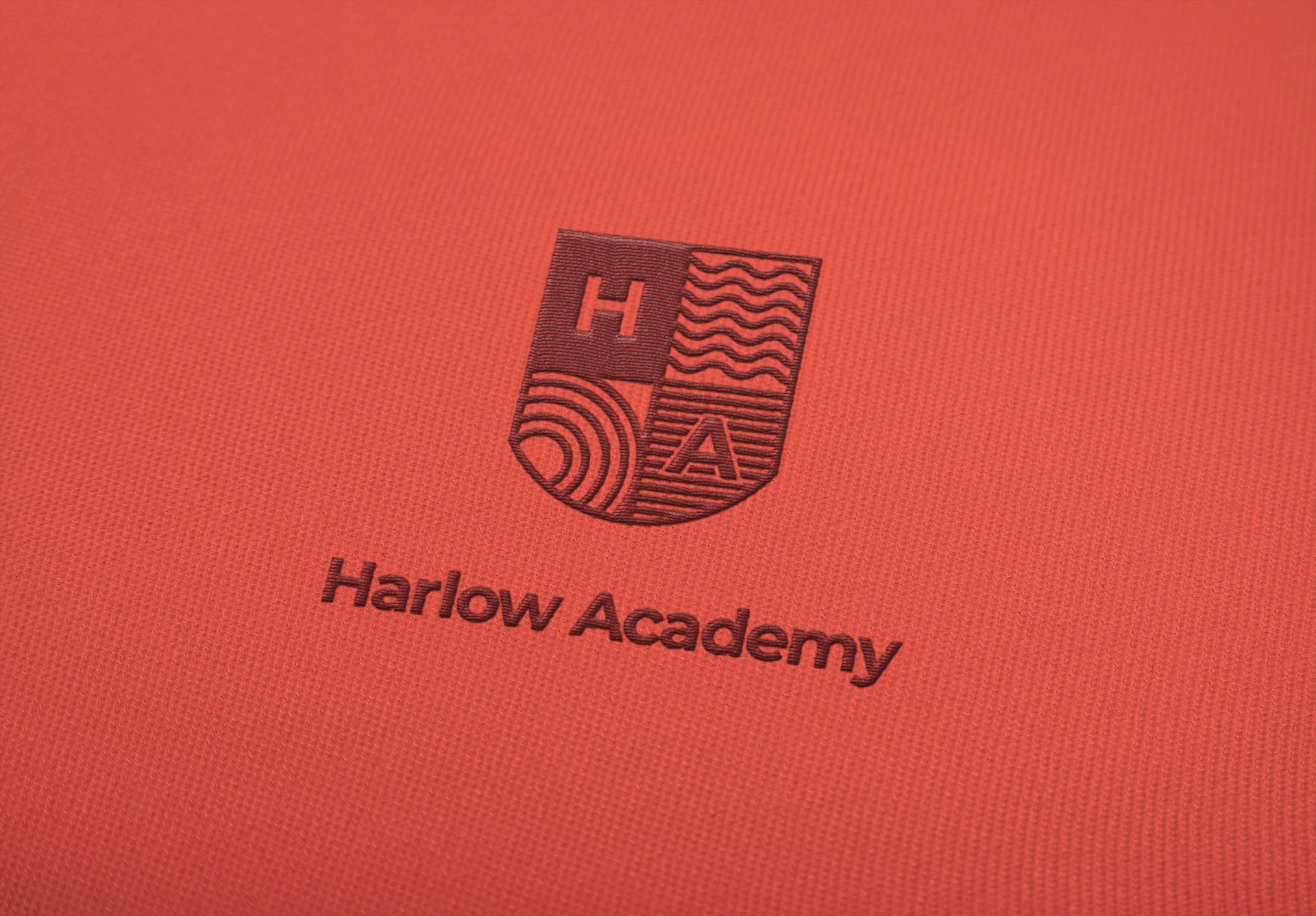
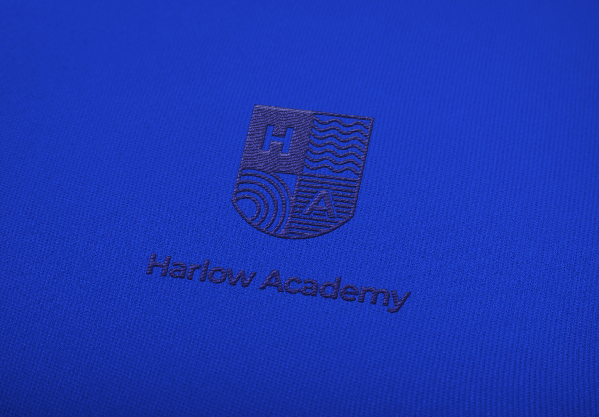
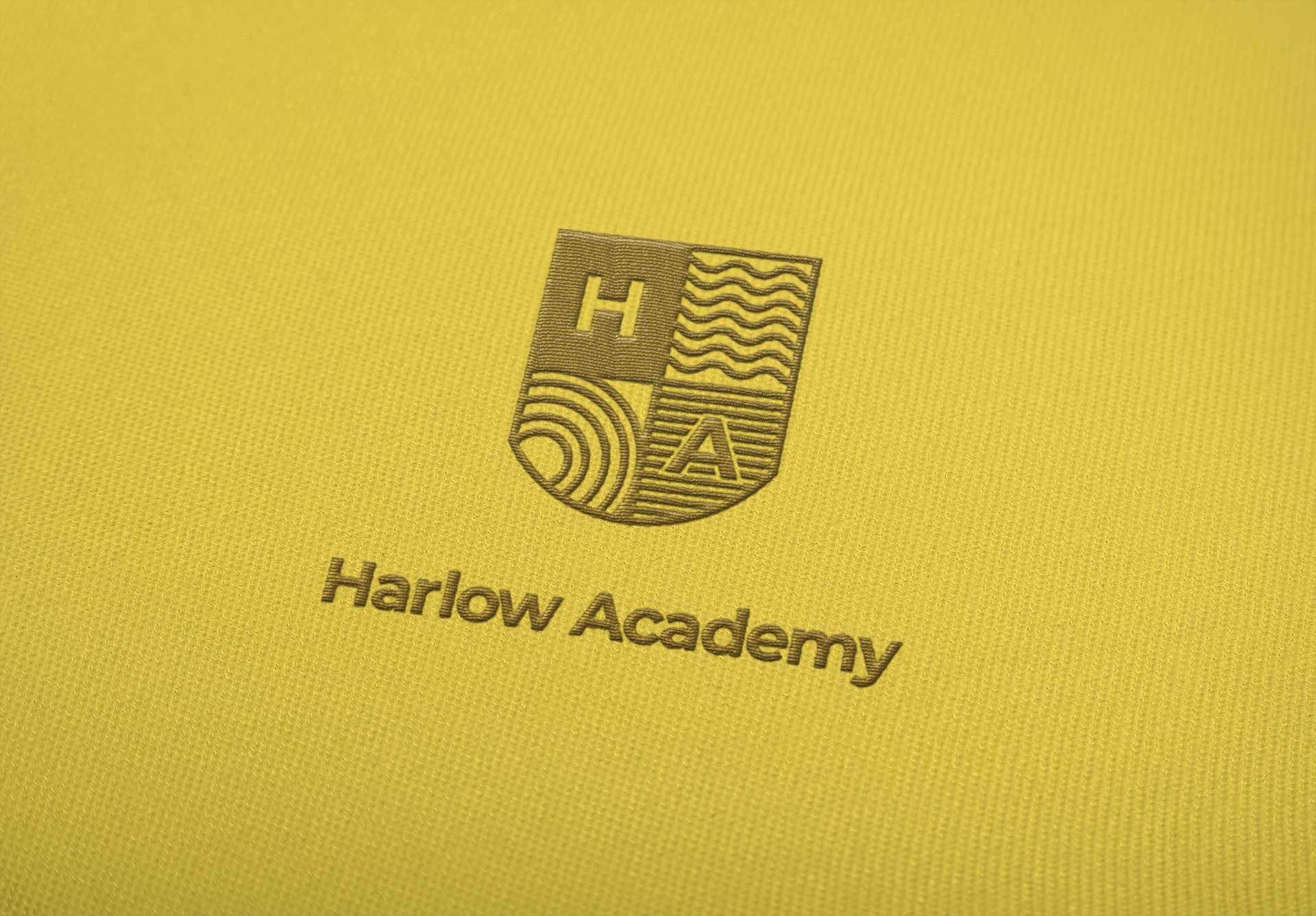
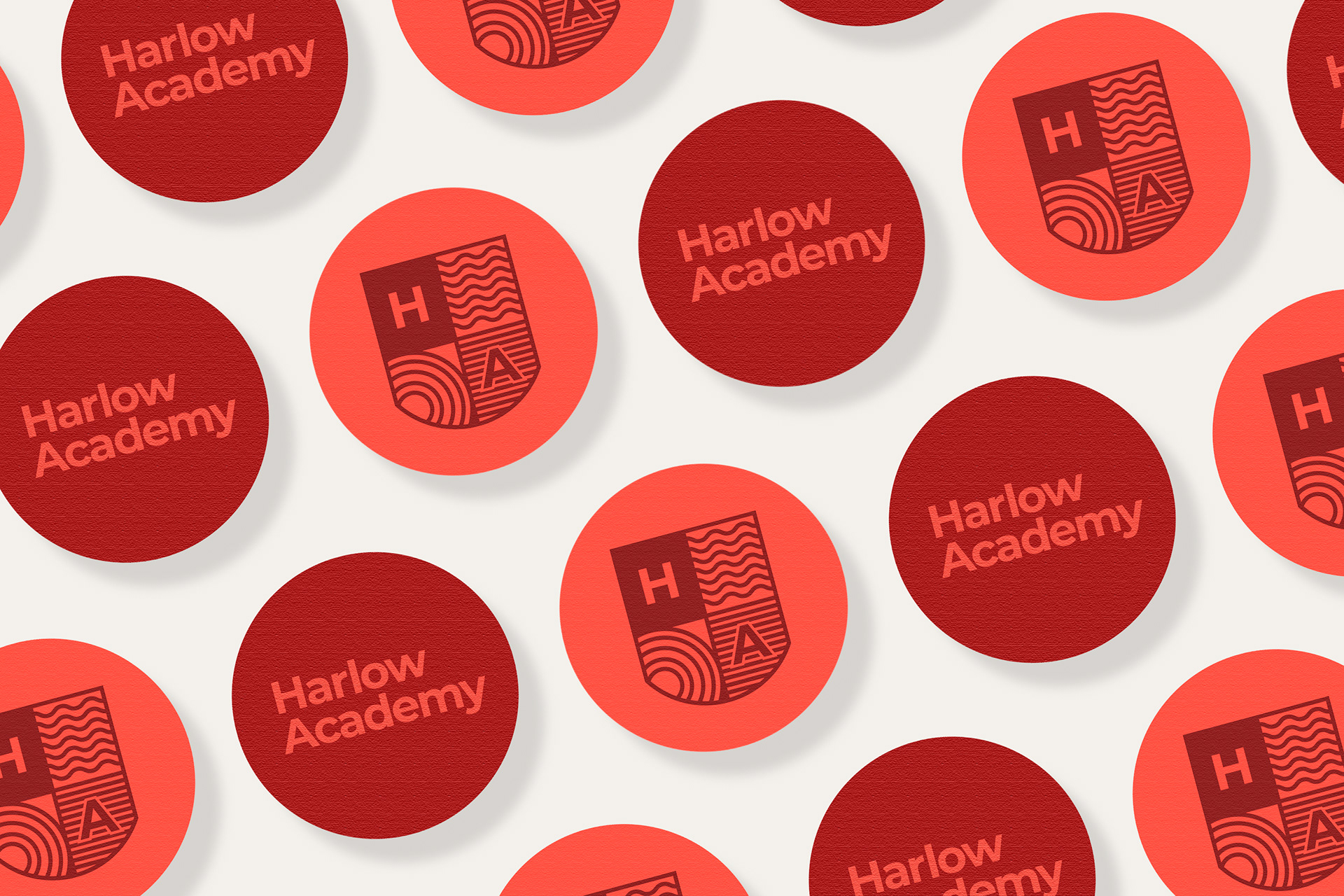
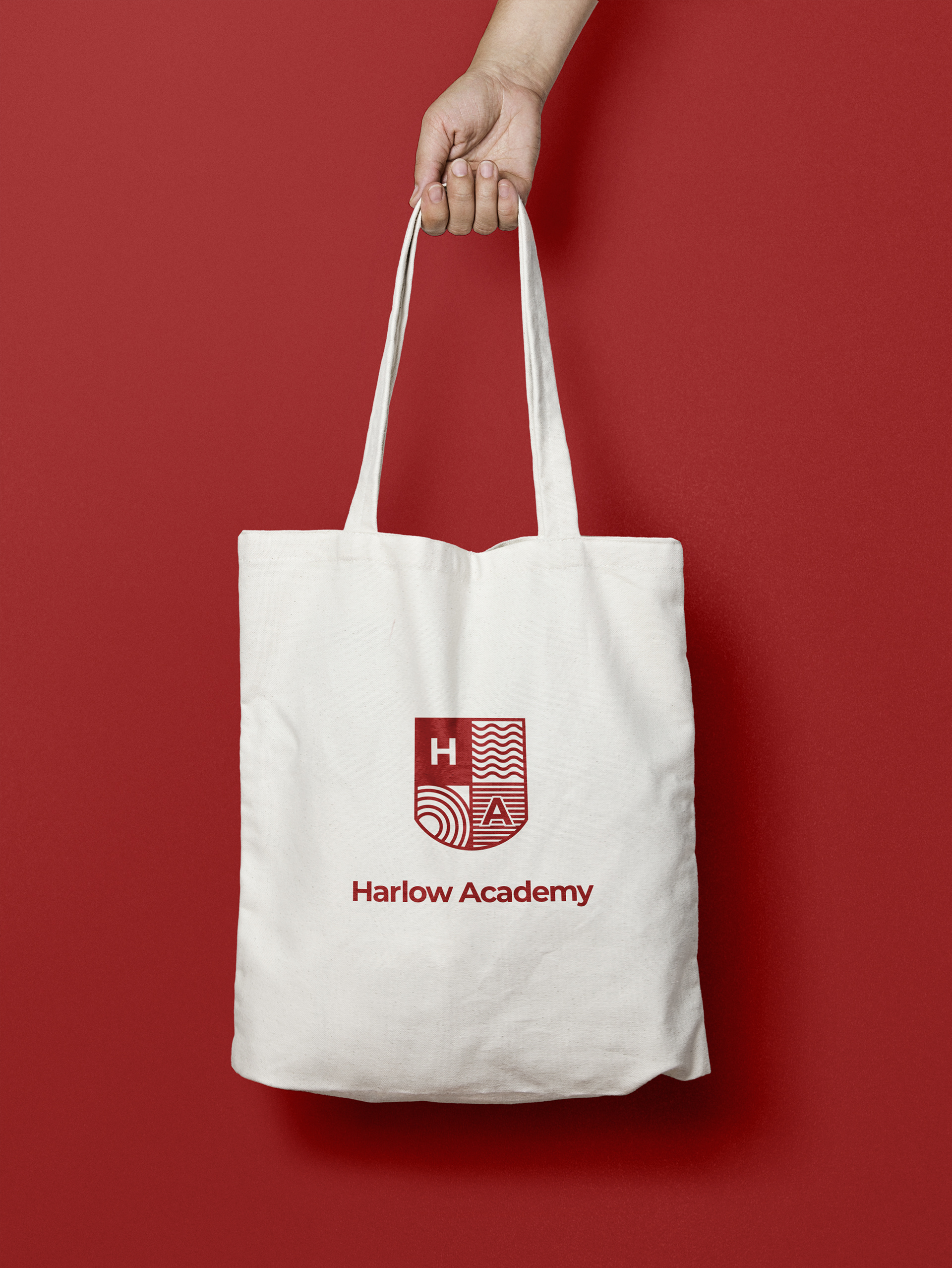
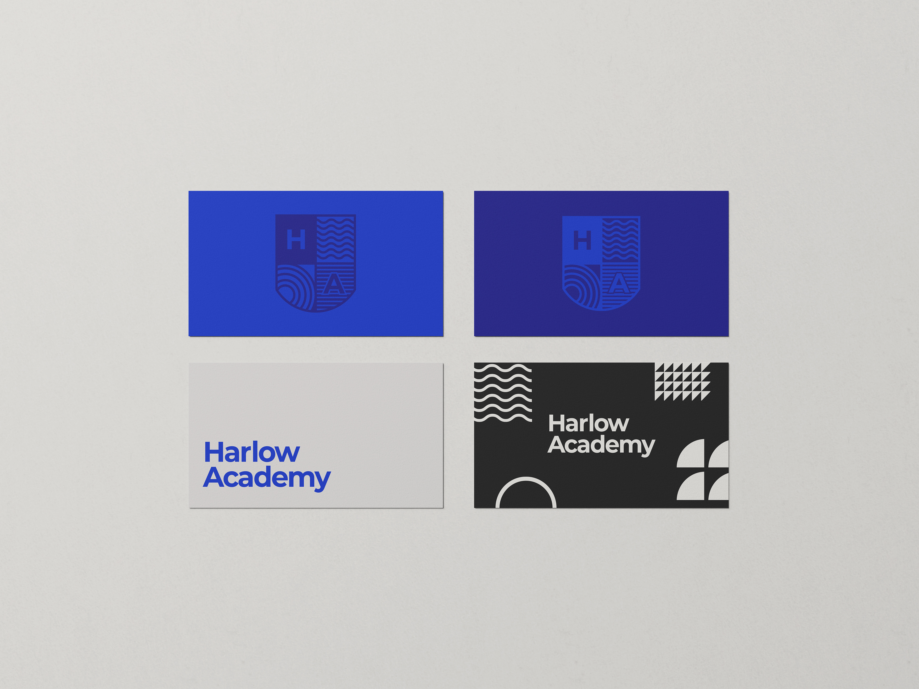
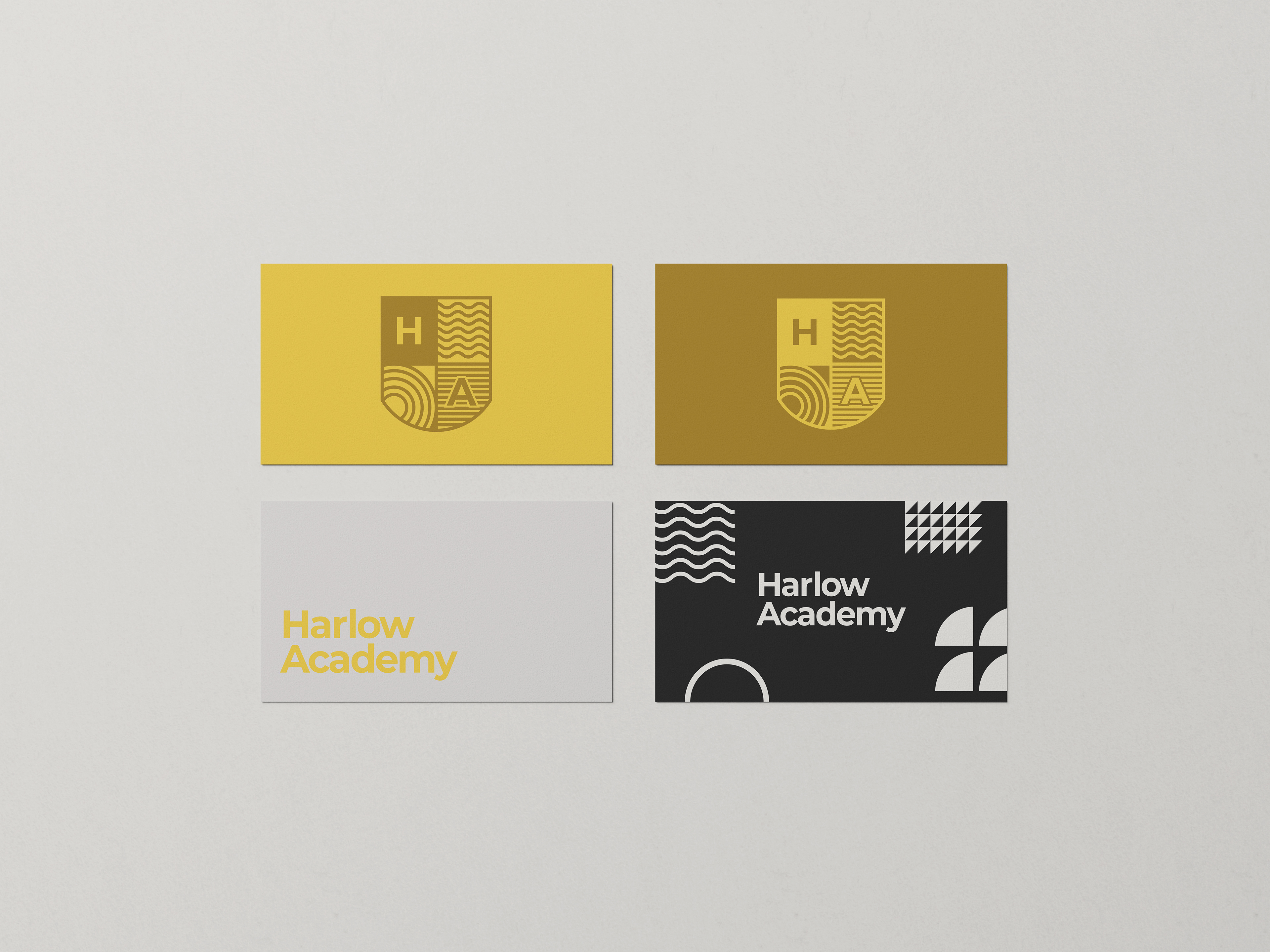
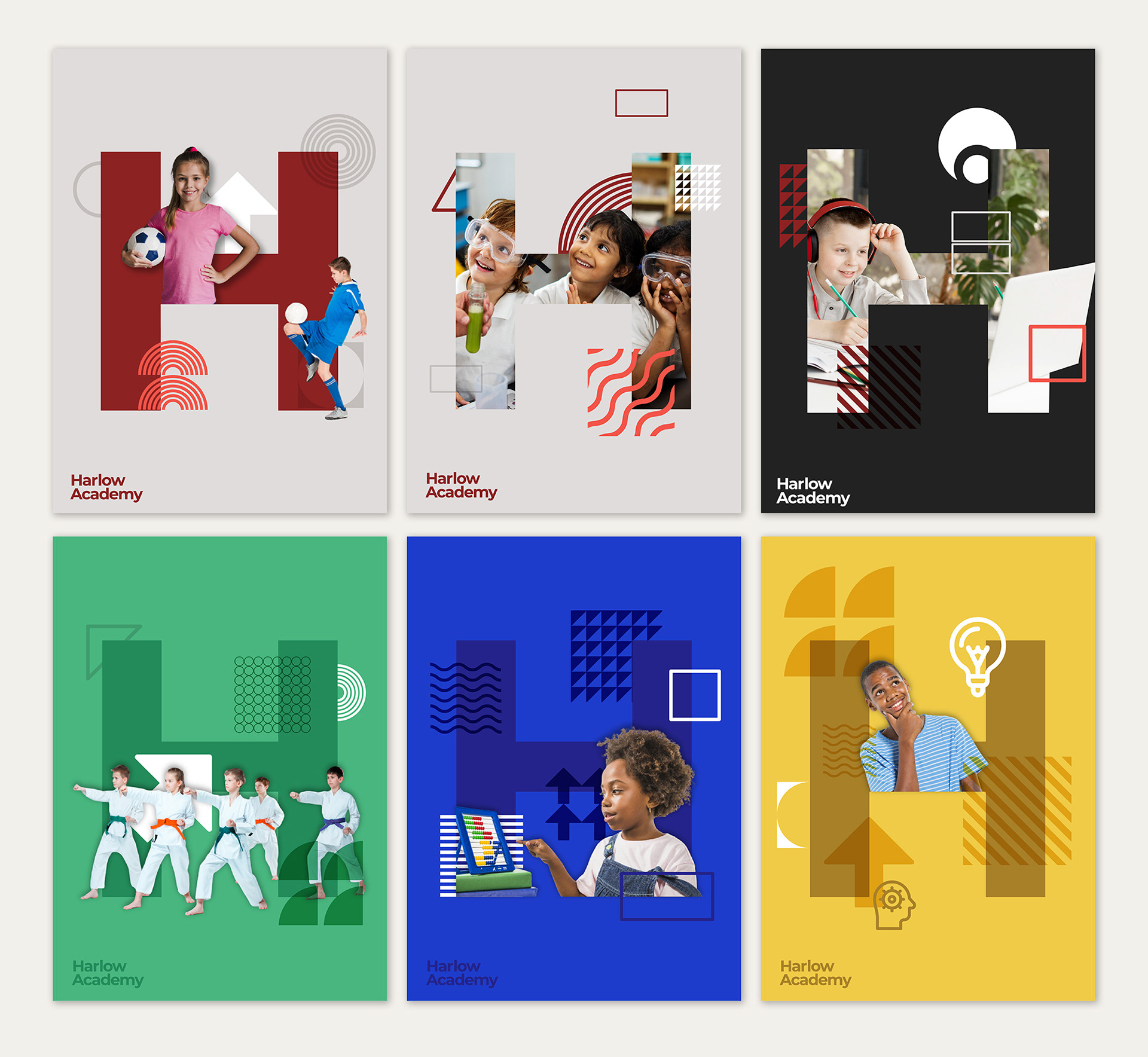
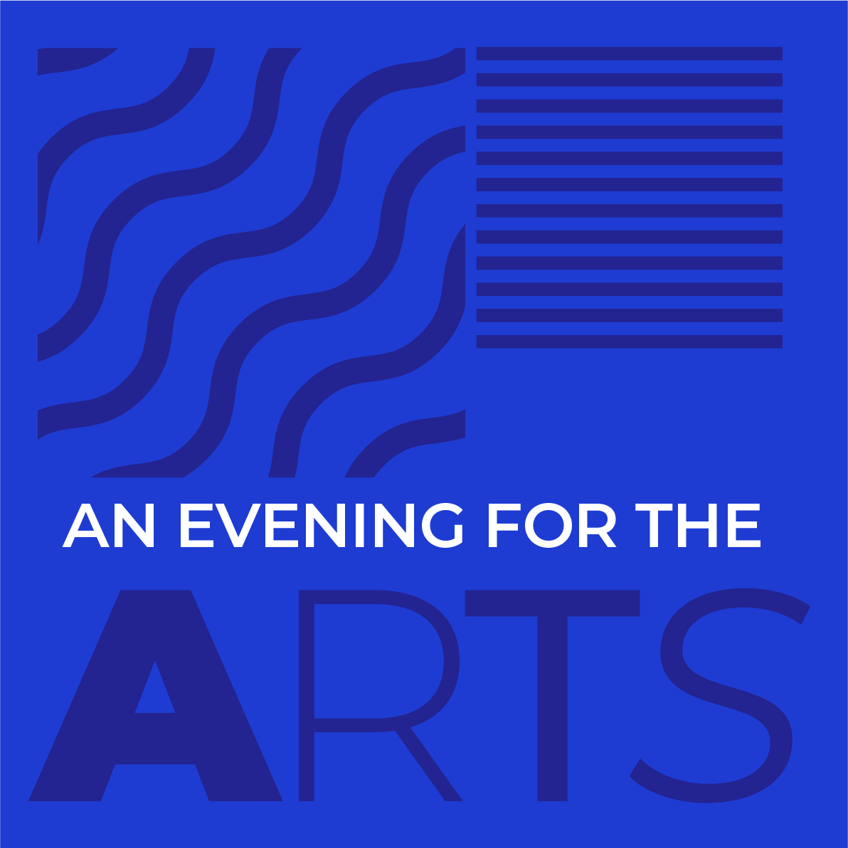
The brand has been designed to give each county their own identity whilst tying all academies into the main Harlow brand. Strong, vibrant colours have been chosen to give a bright, positive and inspiring visual for the students, teachers and parents alike. Graphical elements, typography and iconography have been carefully selected and crafted to give students a modern, fresh, inspiring look that pulls all parts of the brand into a cohesive identity. The graphic elements have been created to reflect inspirational shapes and patterns as well as representing values such as teamwork, growth, community, learning and focus in an abstract form.
Simple, adaptable and strong are the key attributes of the brand and can be easily translated across all media; specifically digital. The digital element of the academies is important in the curriculum and teaching day to day, so something clean and communicative was needed. The essence of the brand identity is to keep things clean, clear & adaptable.