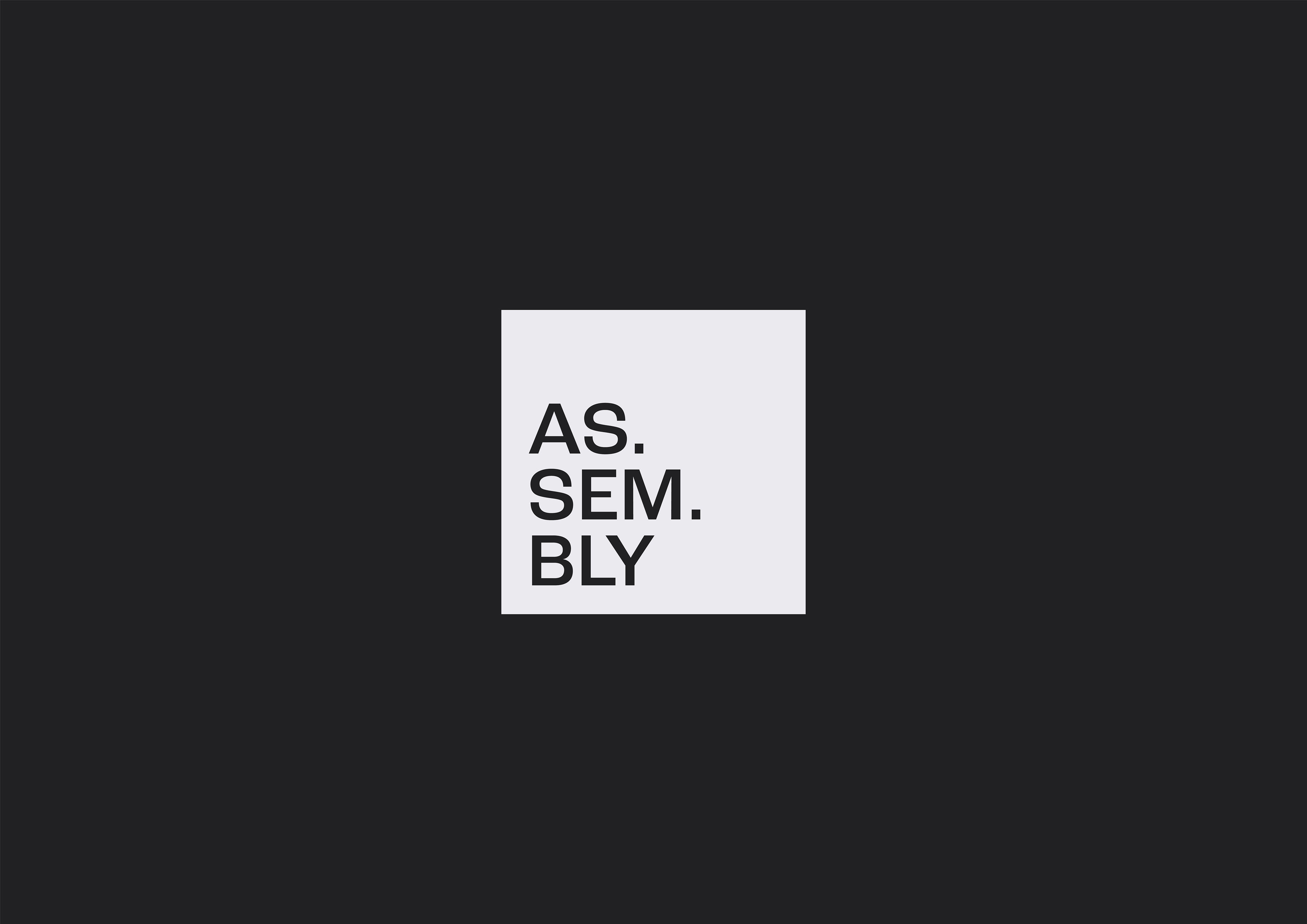
AS.SEM.BLY
As.sem.bly aims to give stories a voice, share them, spread them, be a vessel that stories use to connect with people - all people.
Our "how" isn't about the mechanics by which stories are told, but more about engaging, thought-provoking content + curated experiential events.
BRANDING
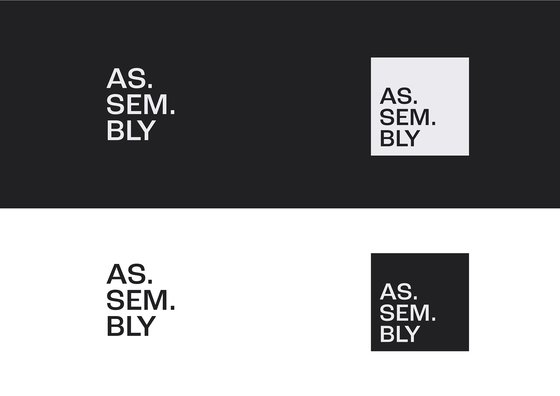
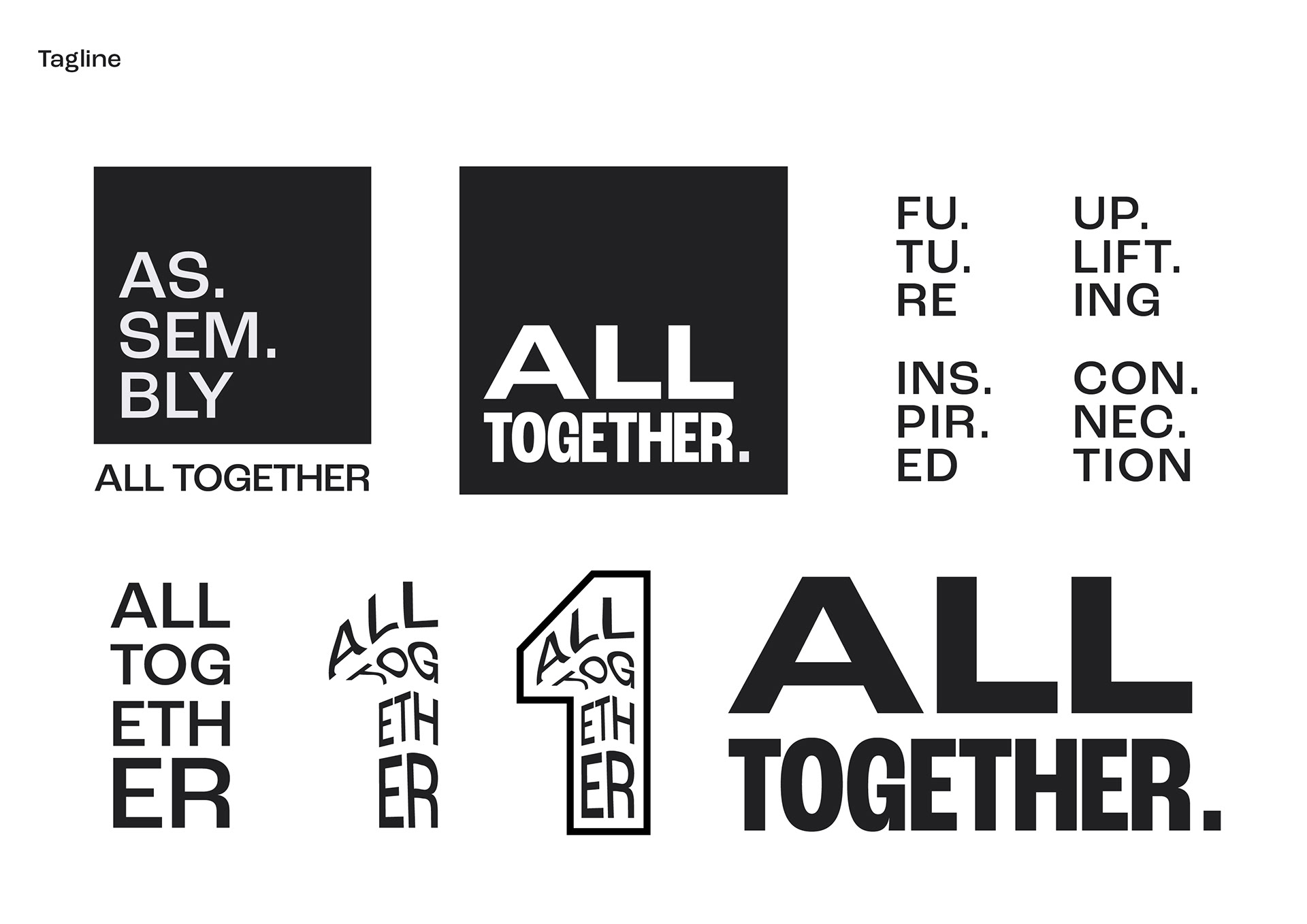
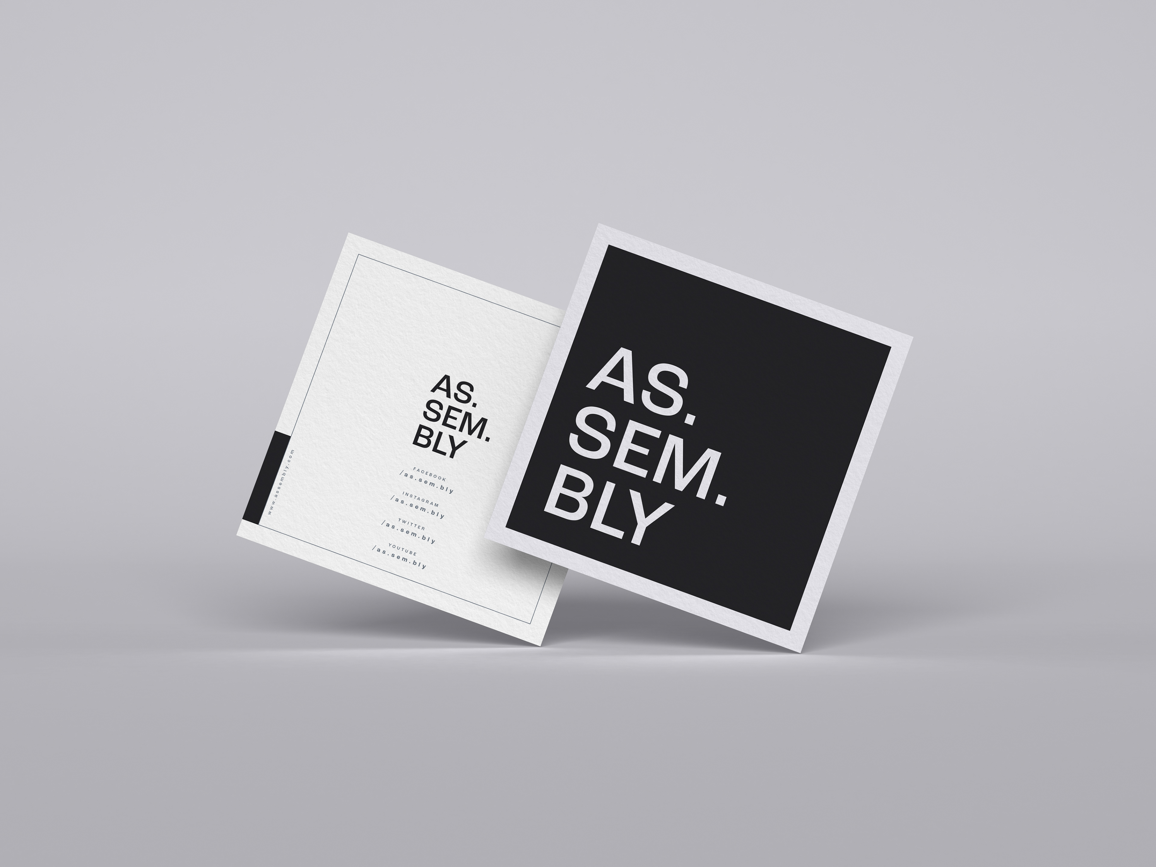
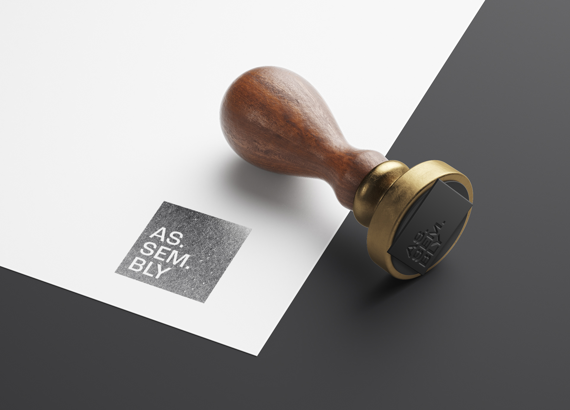
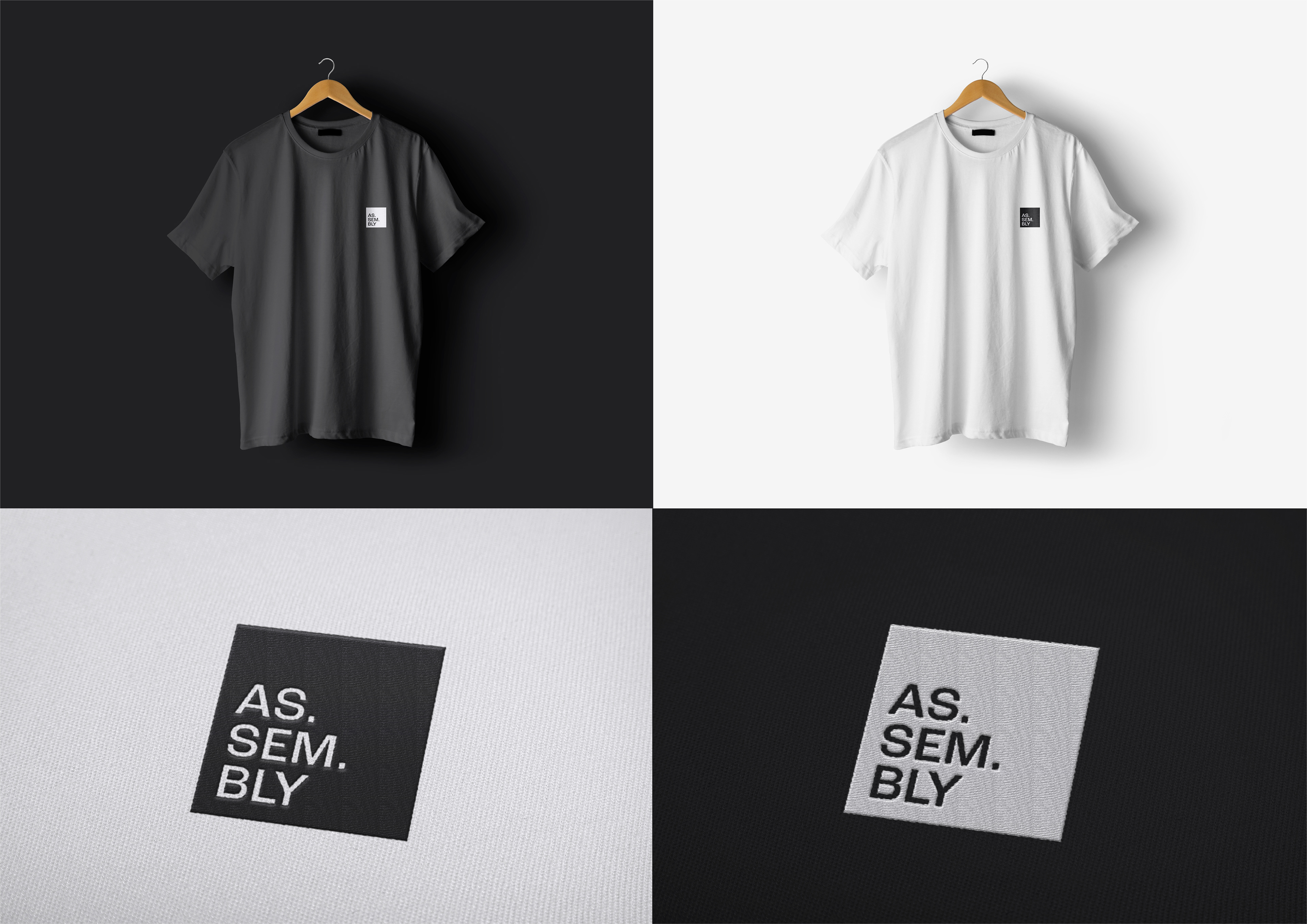
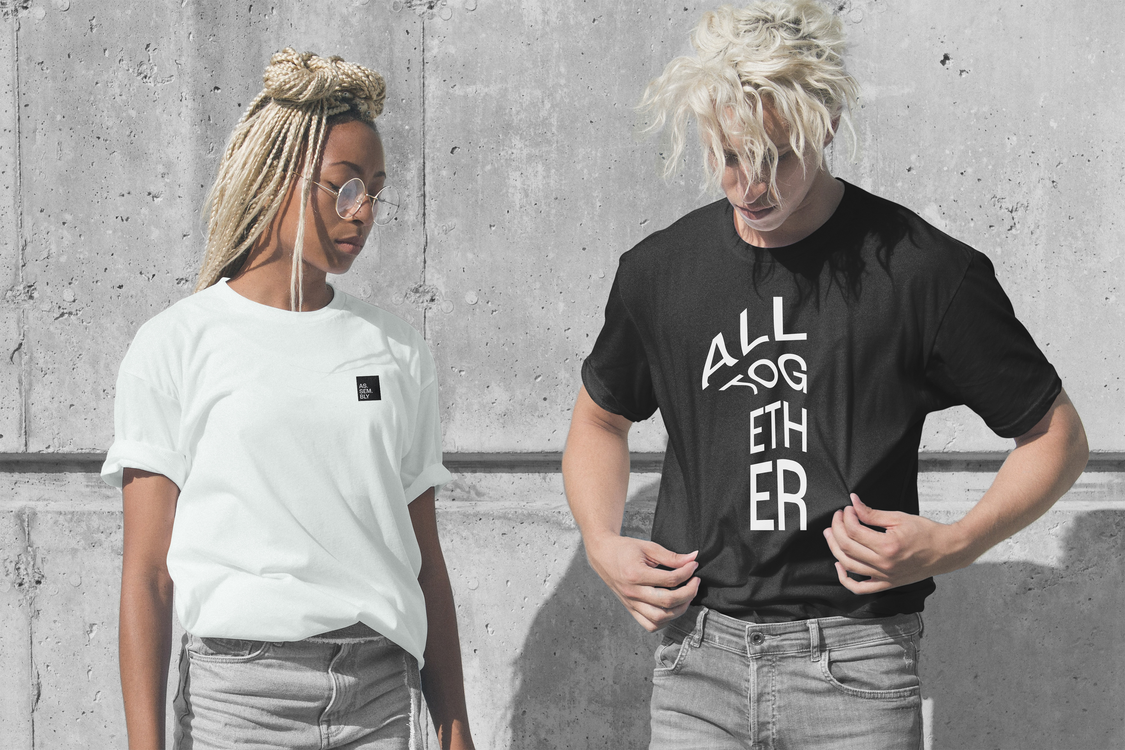
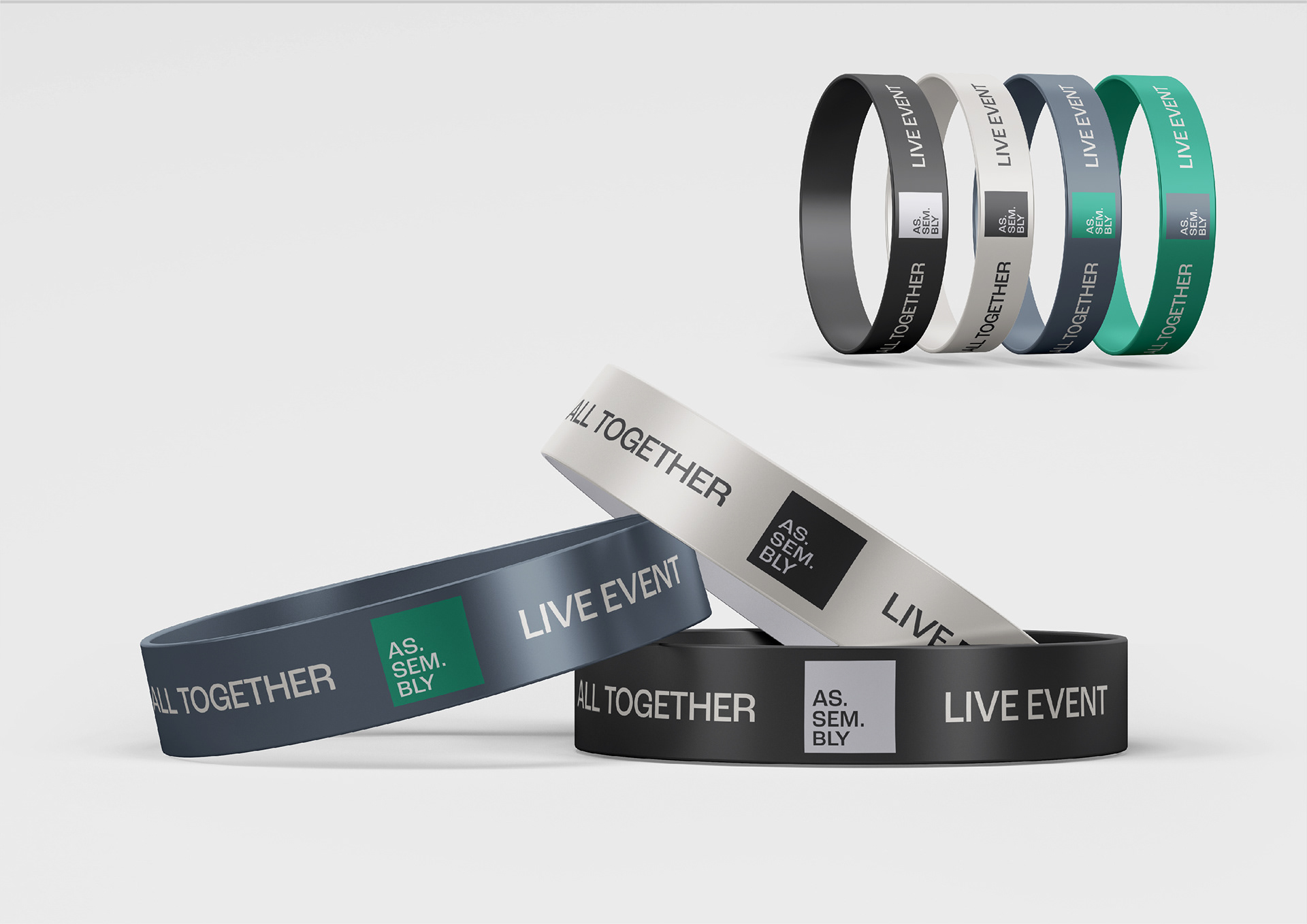
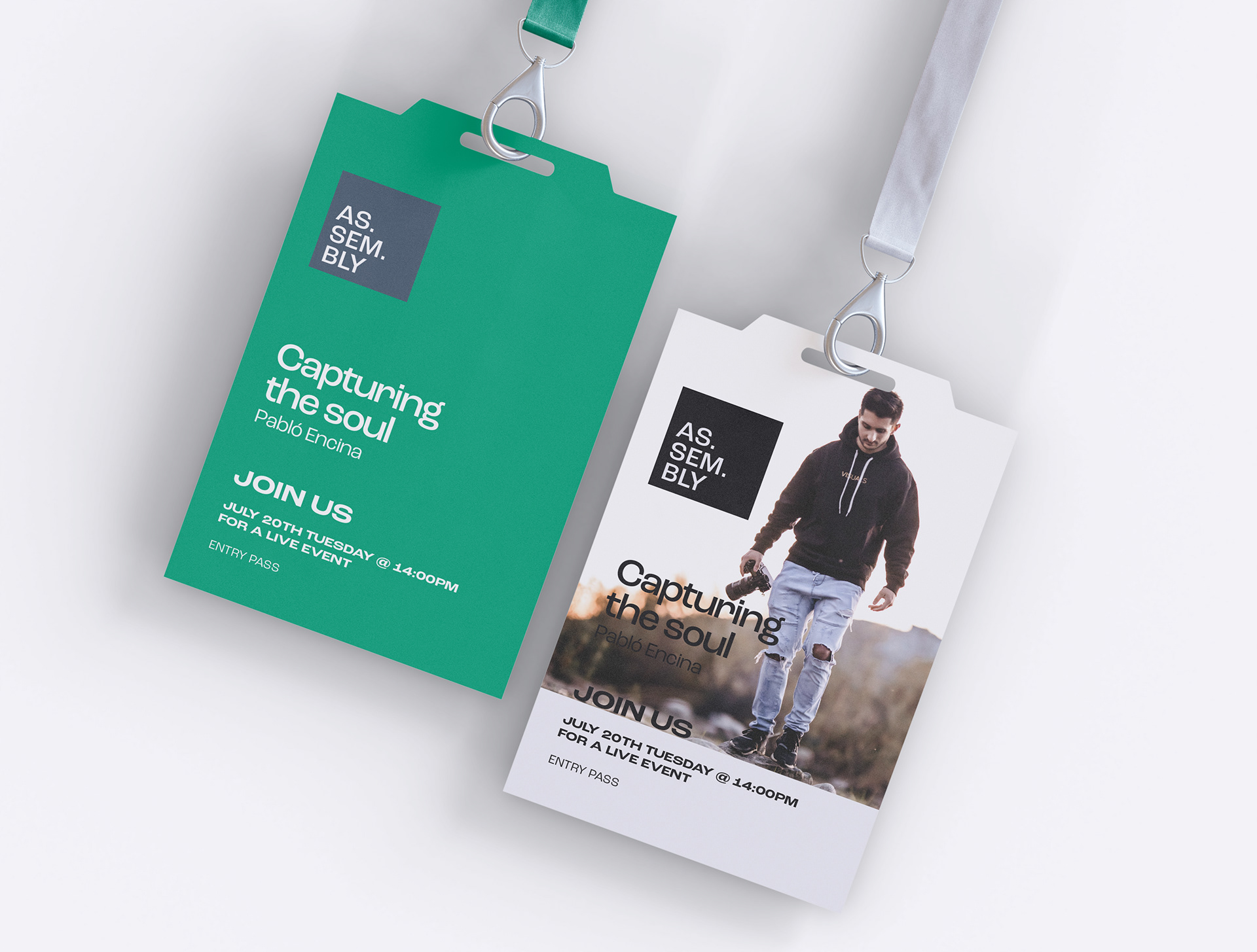
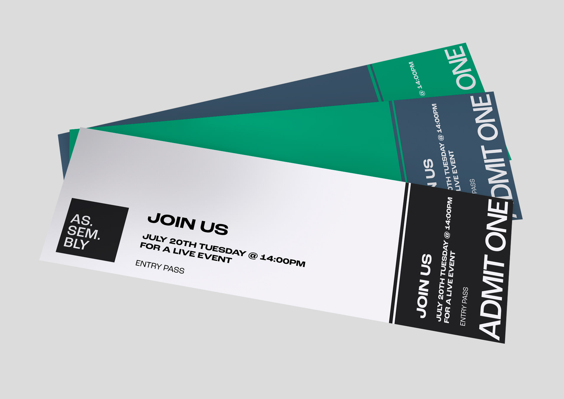
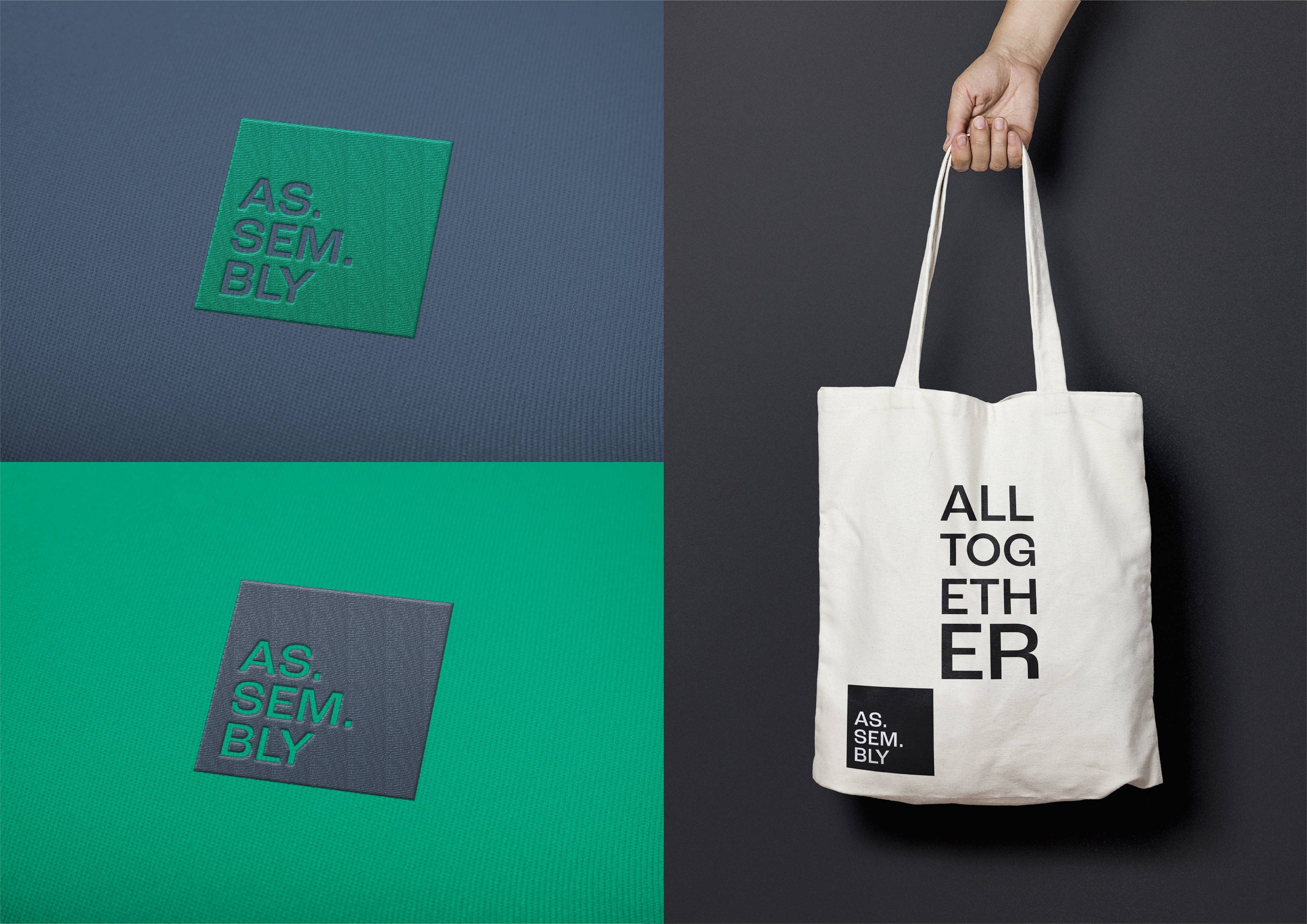
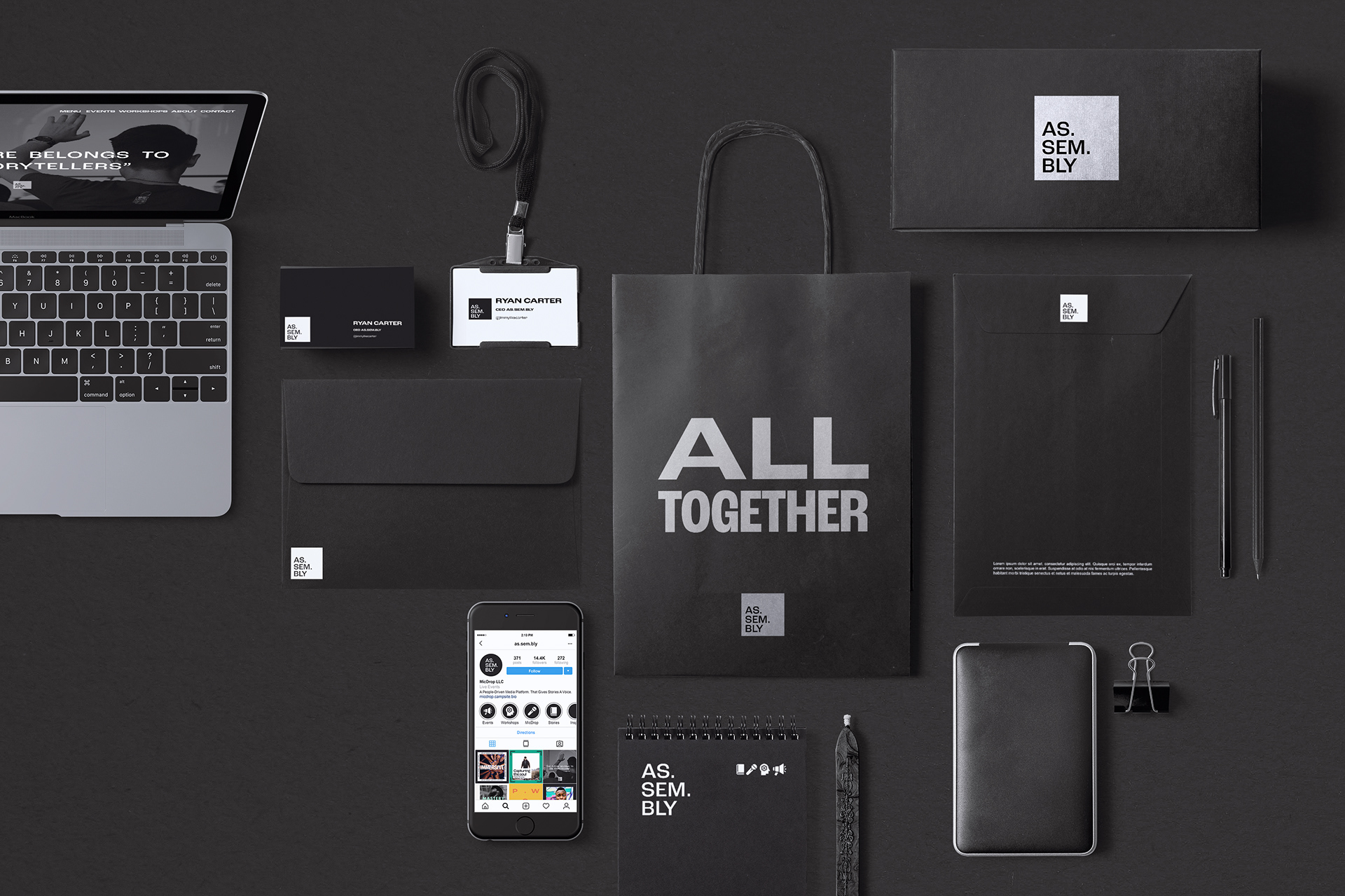
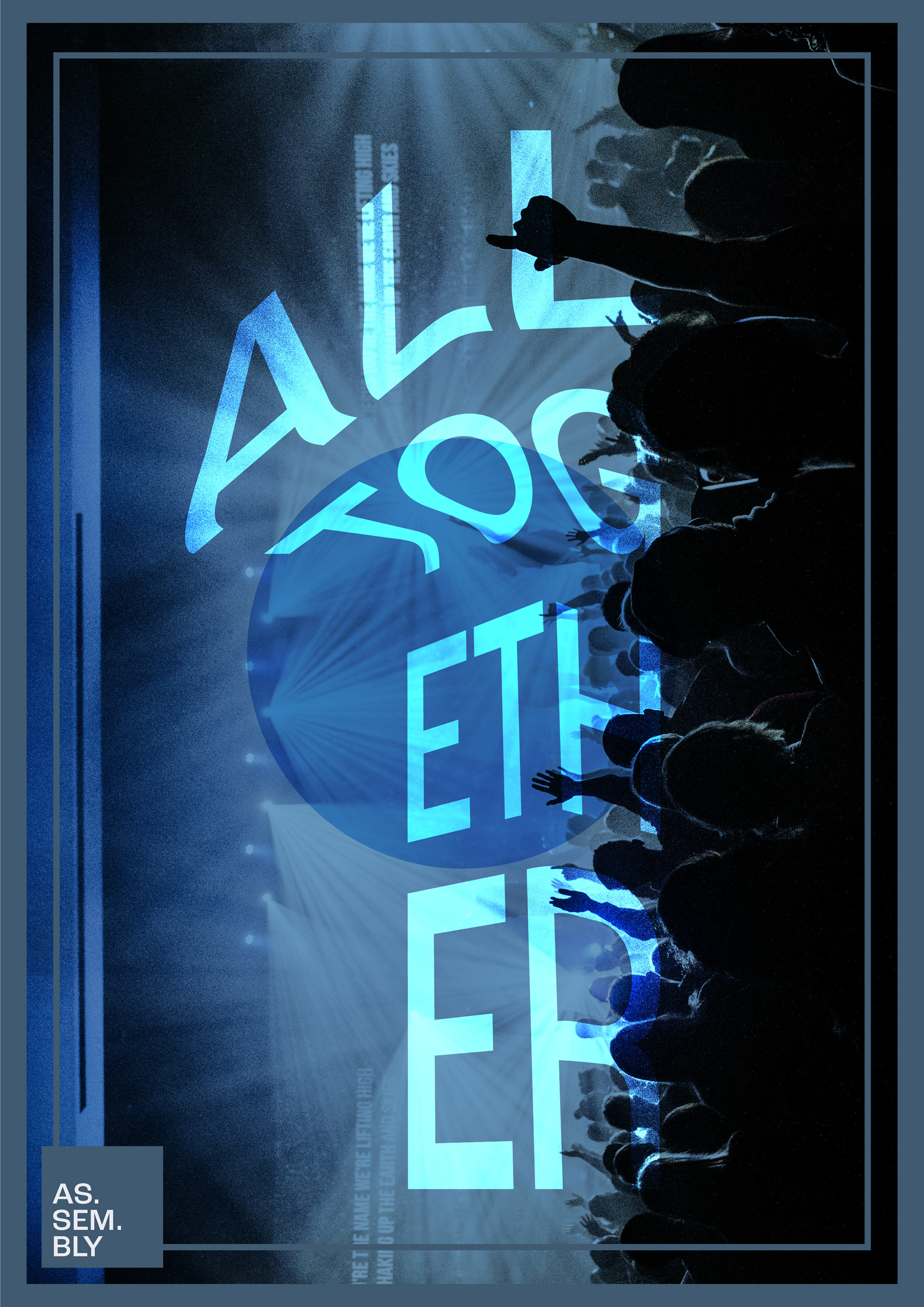
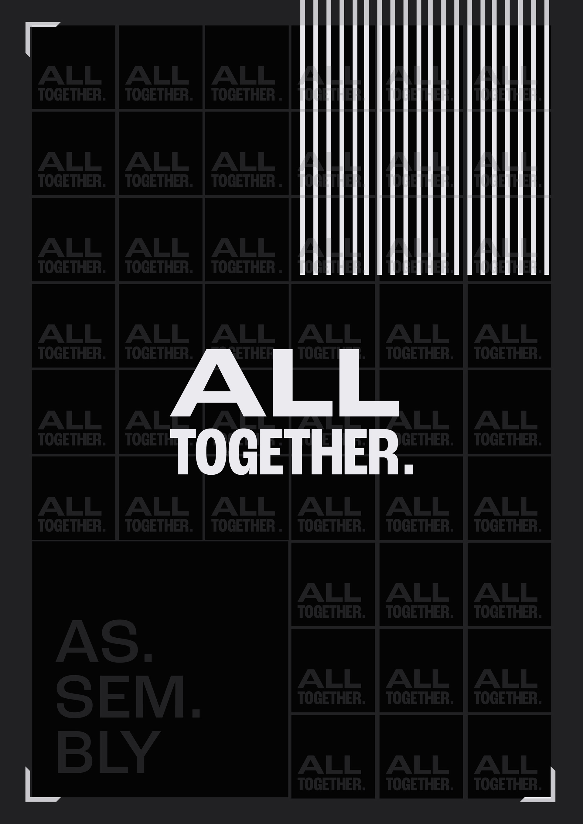
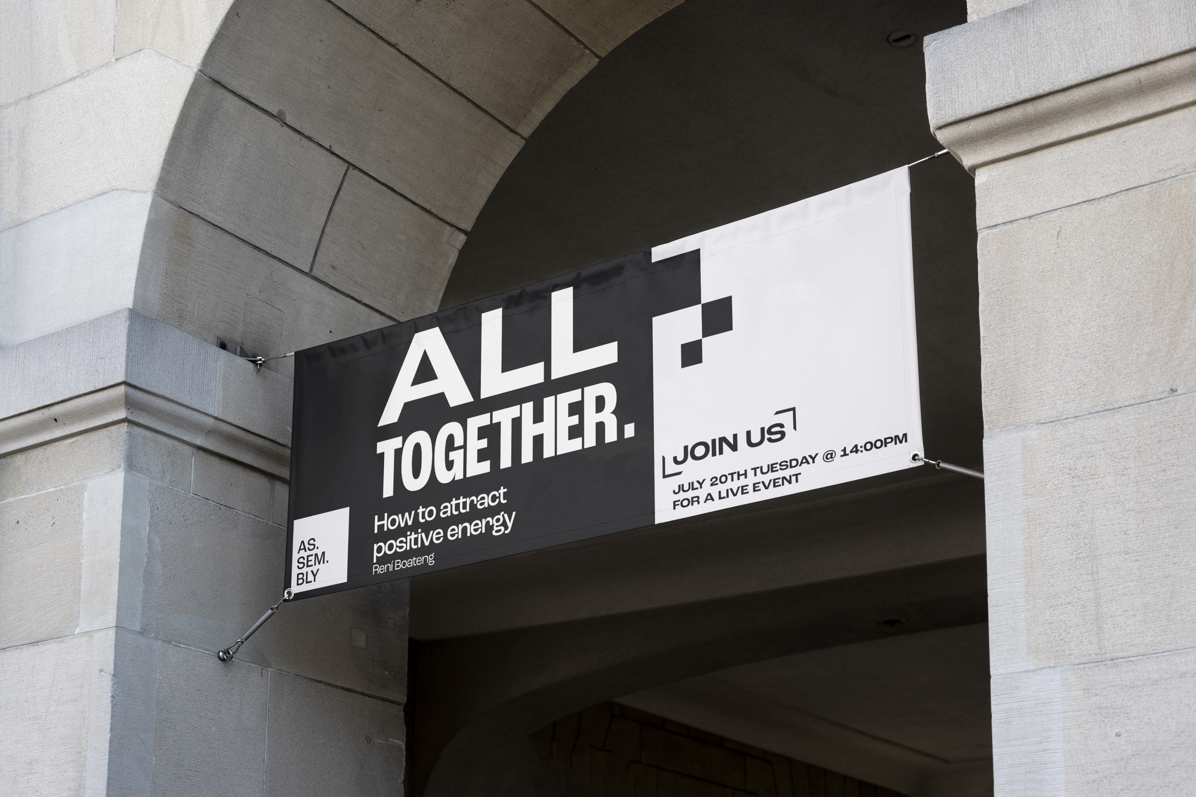
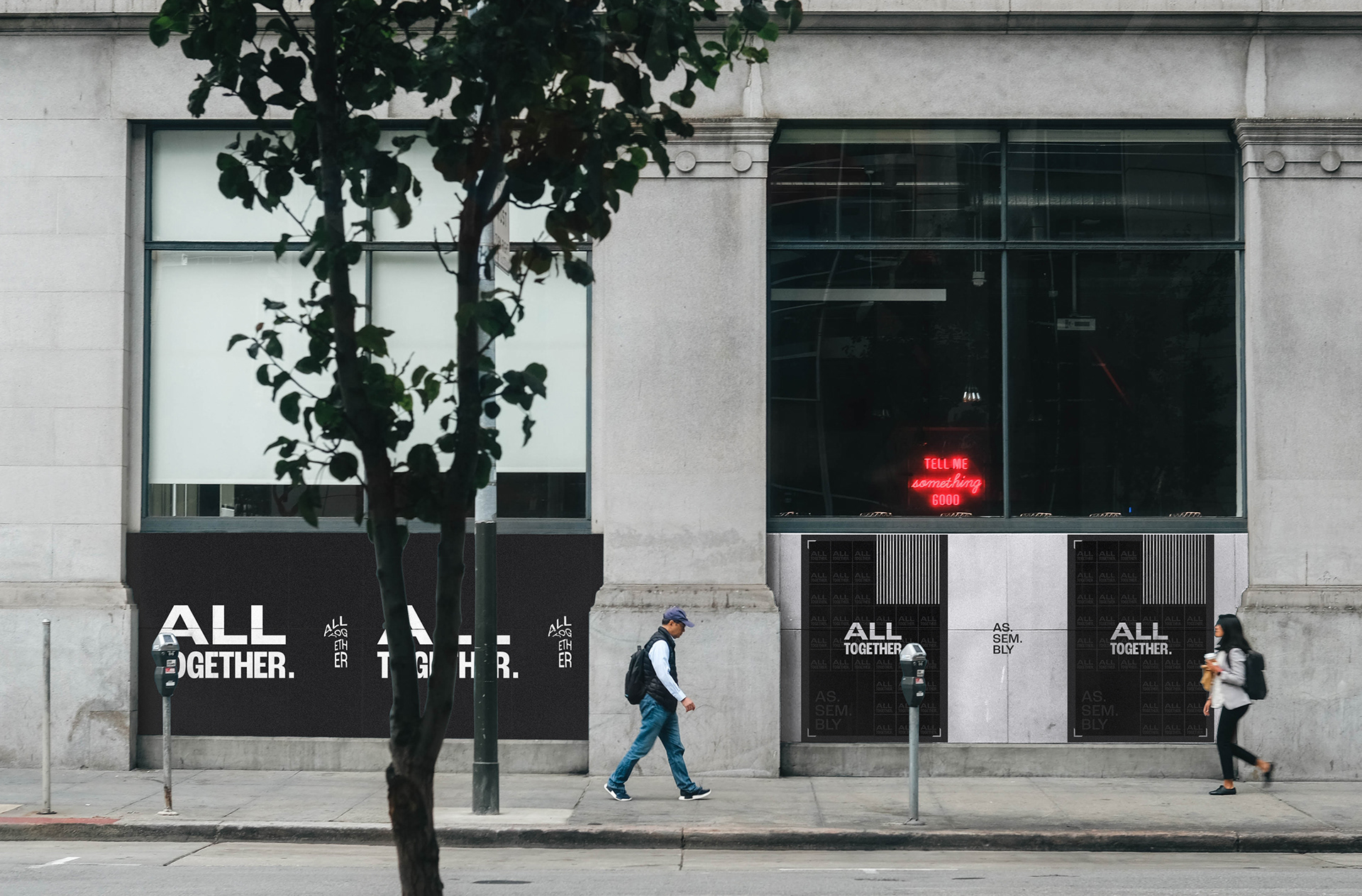
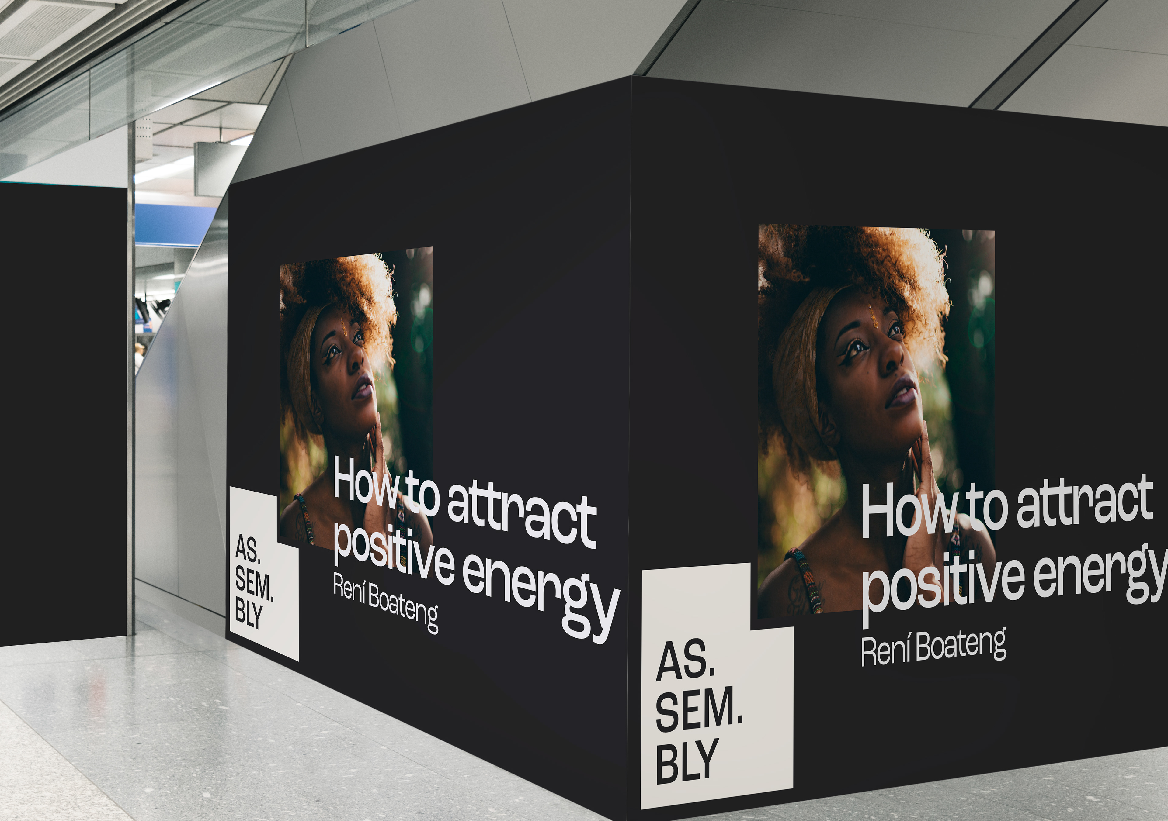
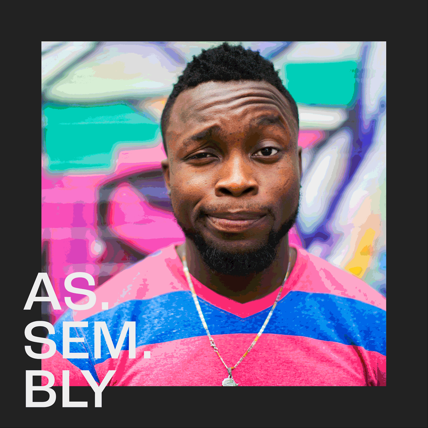
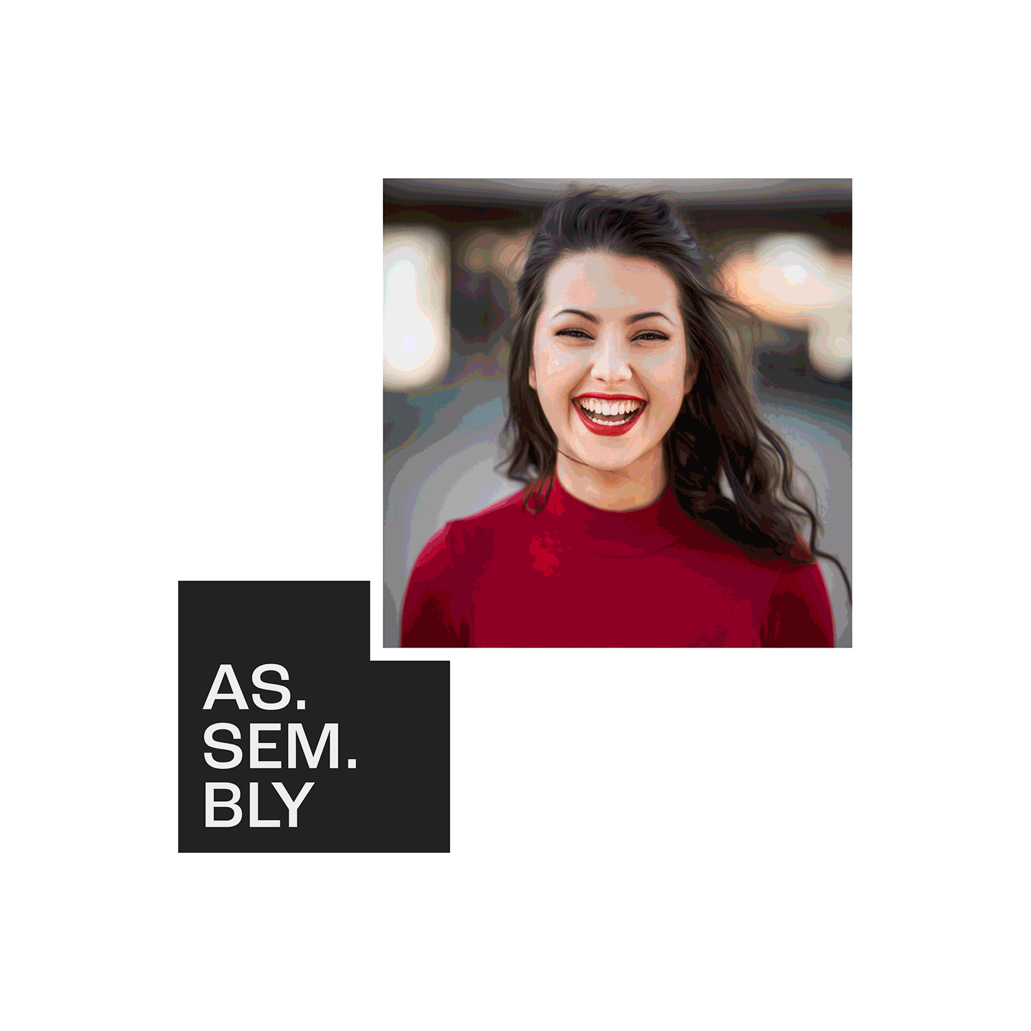
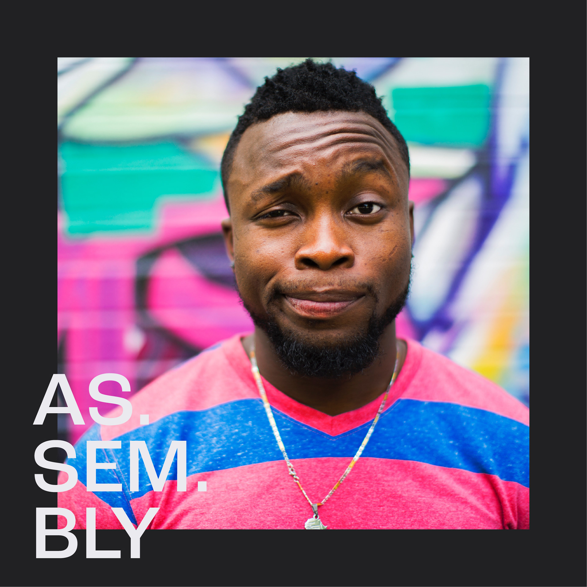
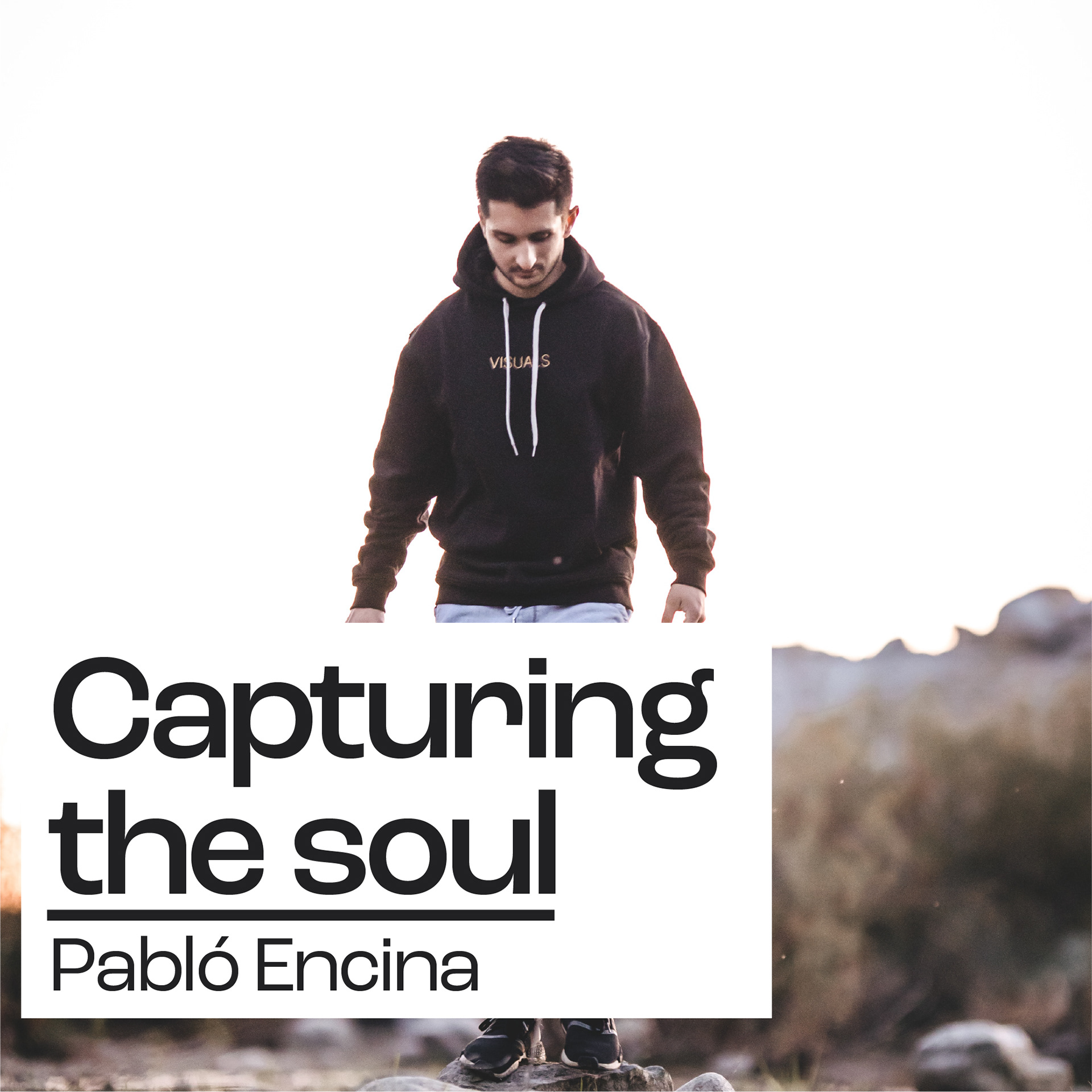
The brand has been crafted to be the vessel that showcases the story being told, through the square shape container which acts as an anchor for the brand and everything stems from this. We wanted to keep things simple, so that the main focus is on the story or person presenting and remains flexible.
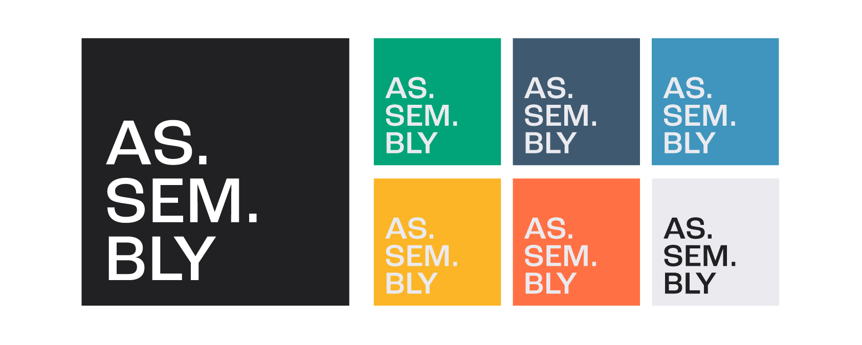
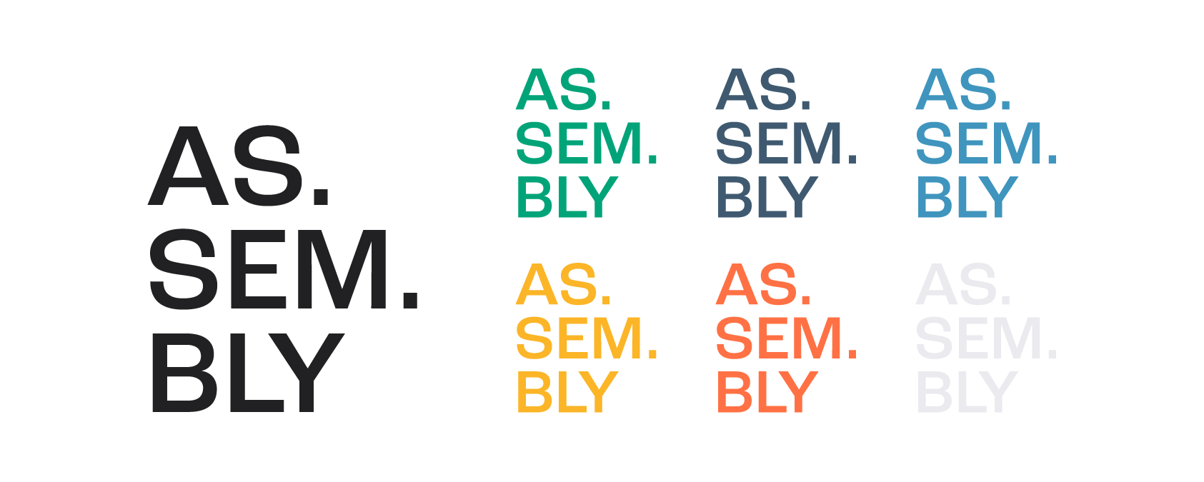
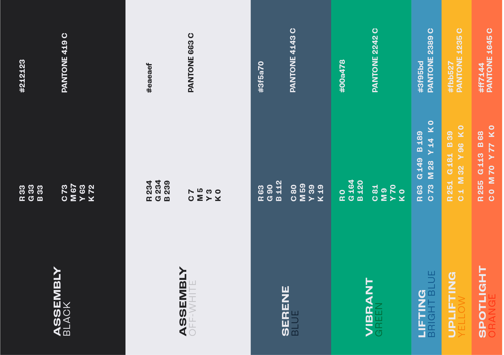
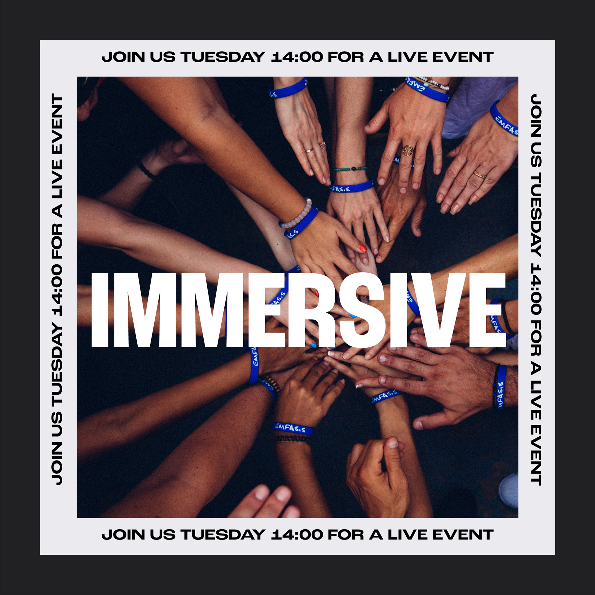
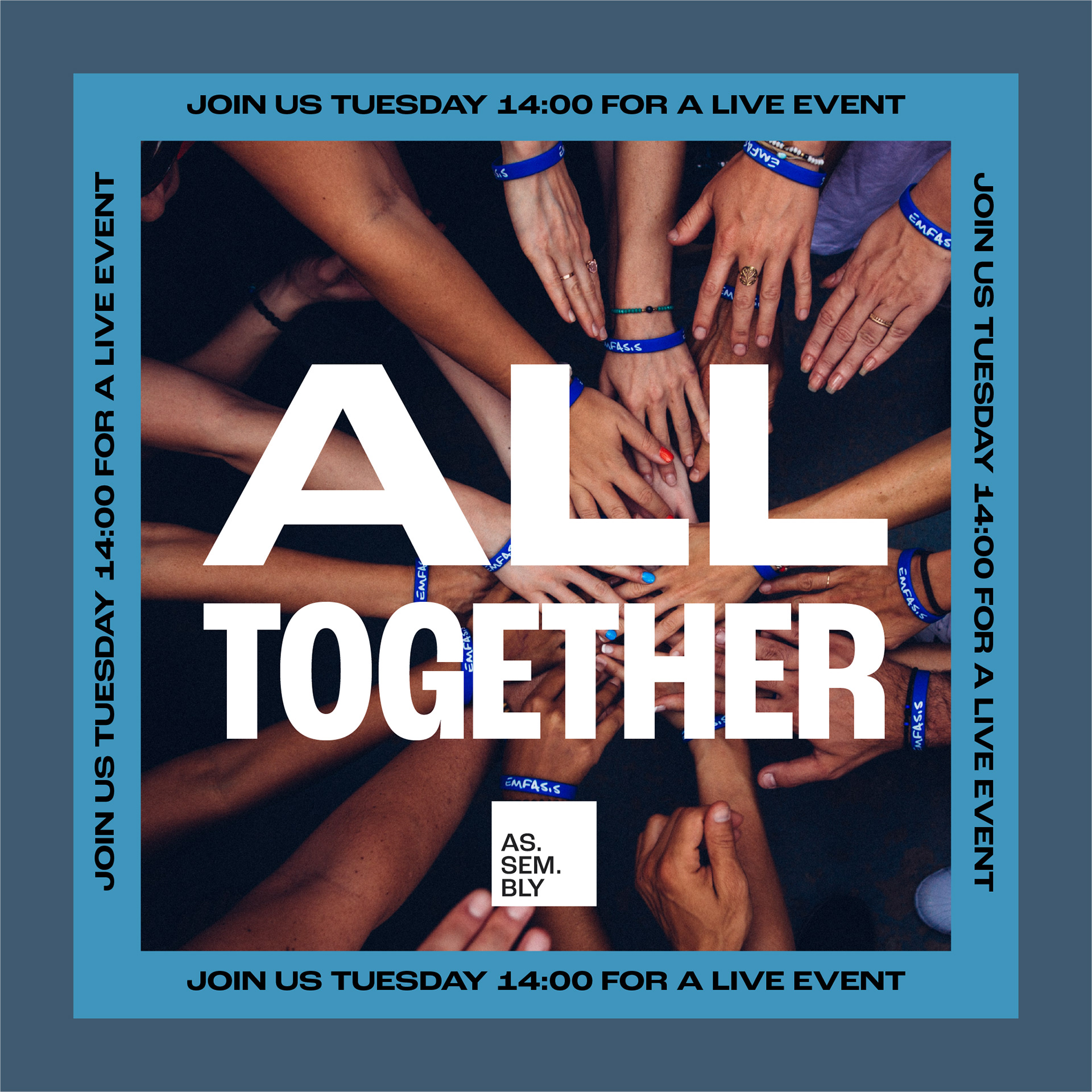
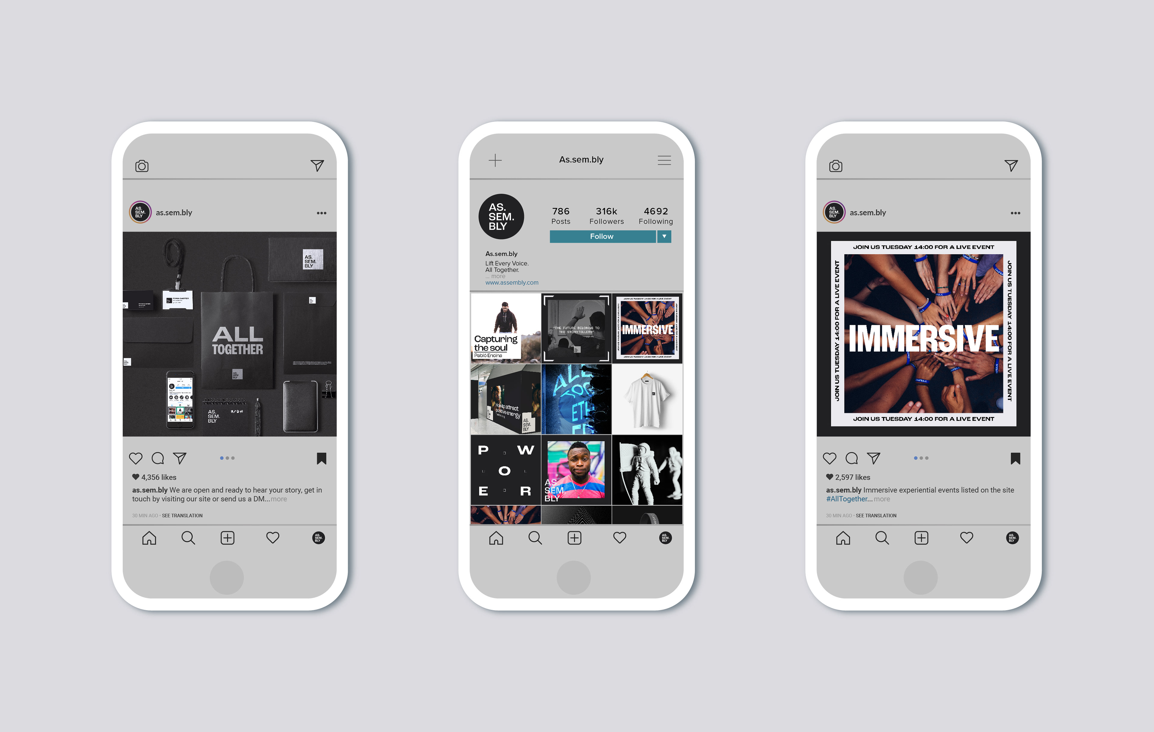
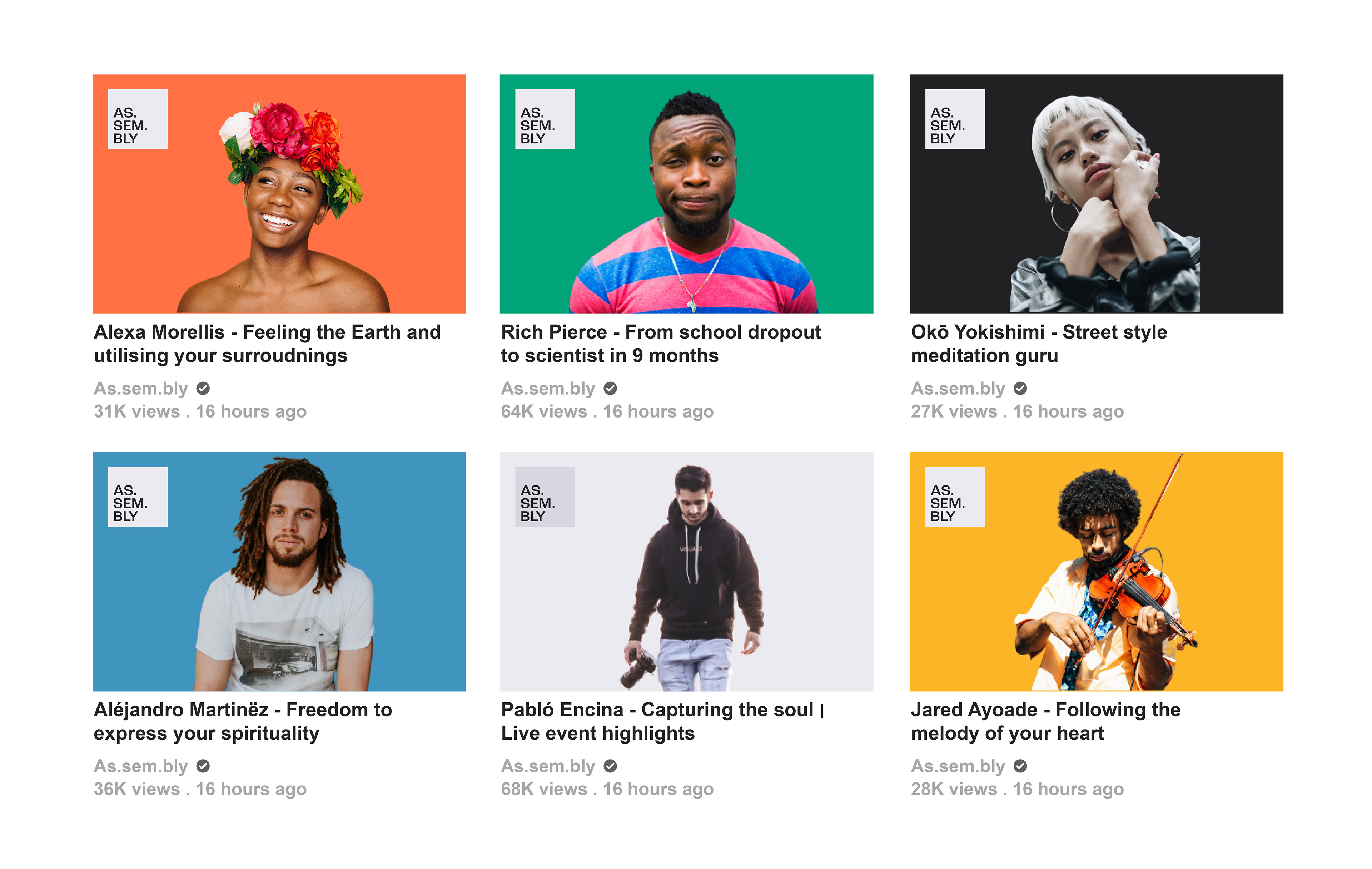
The colour palette has been created to reflect the principles of the brand: uplifting, vibrant, representative, shining a spotlight and engaging. We wanted to create a modern, fresh, youthful and urban media vibe to the brand, the graphic elements paired with the type as well as the colour to create a strong identity that translates across demographics. The visuals needed to adapt across digital and print media, particularly at live events.
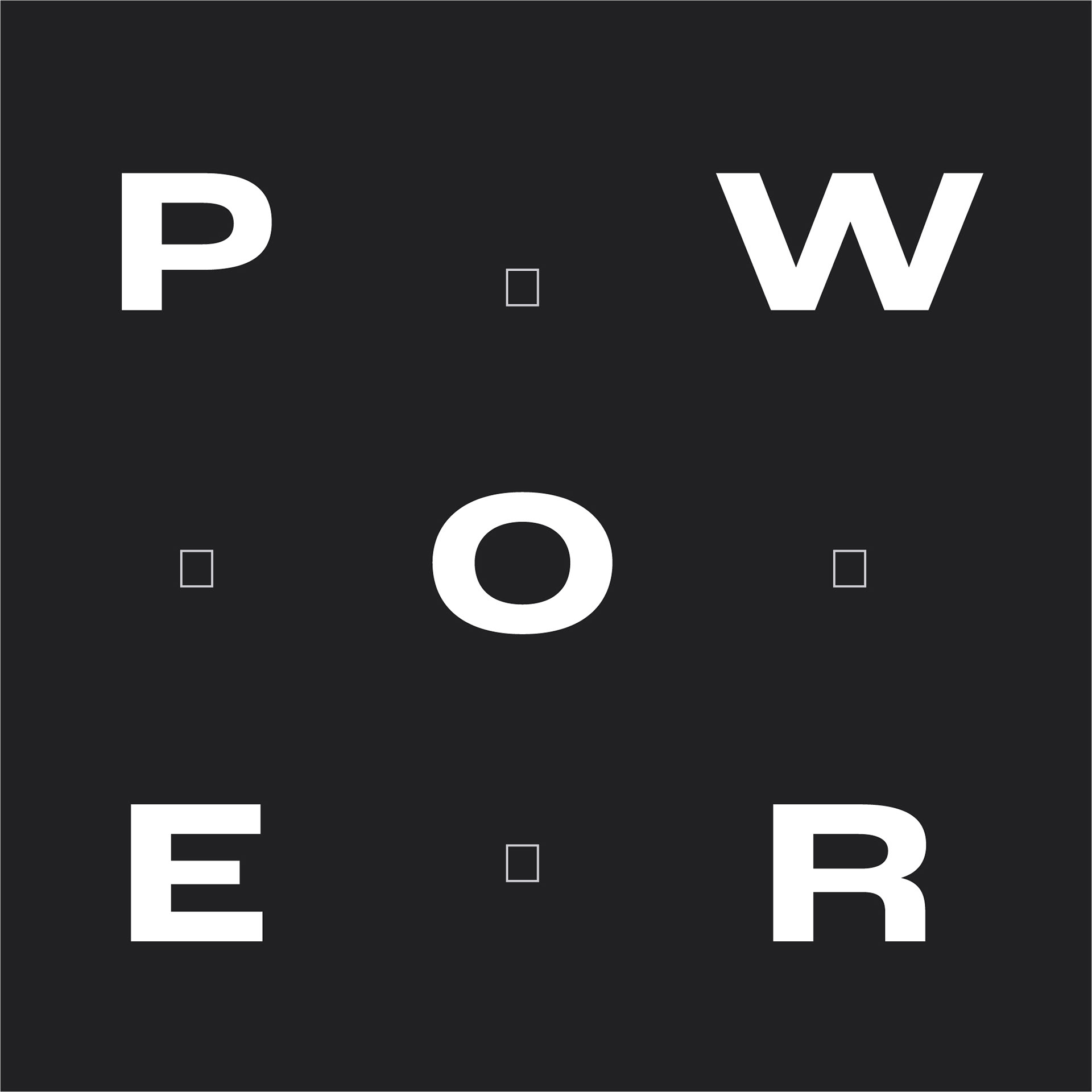
TYPOGRAPHY
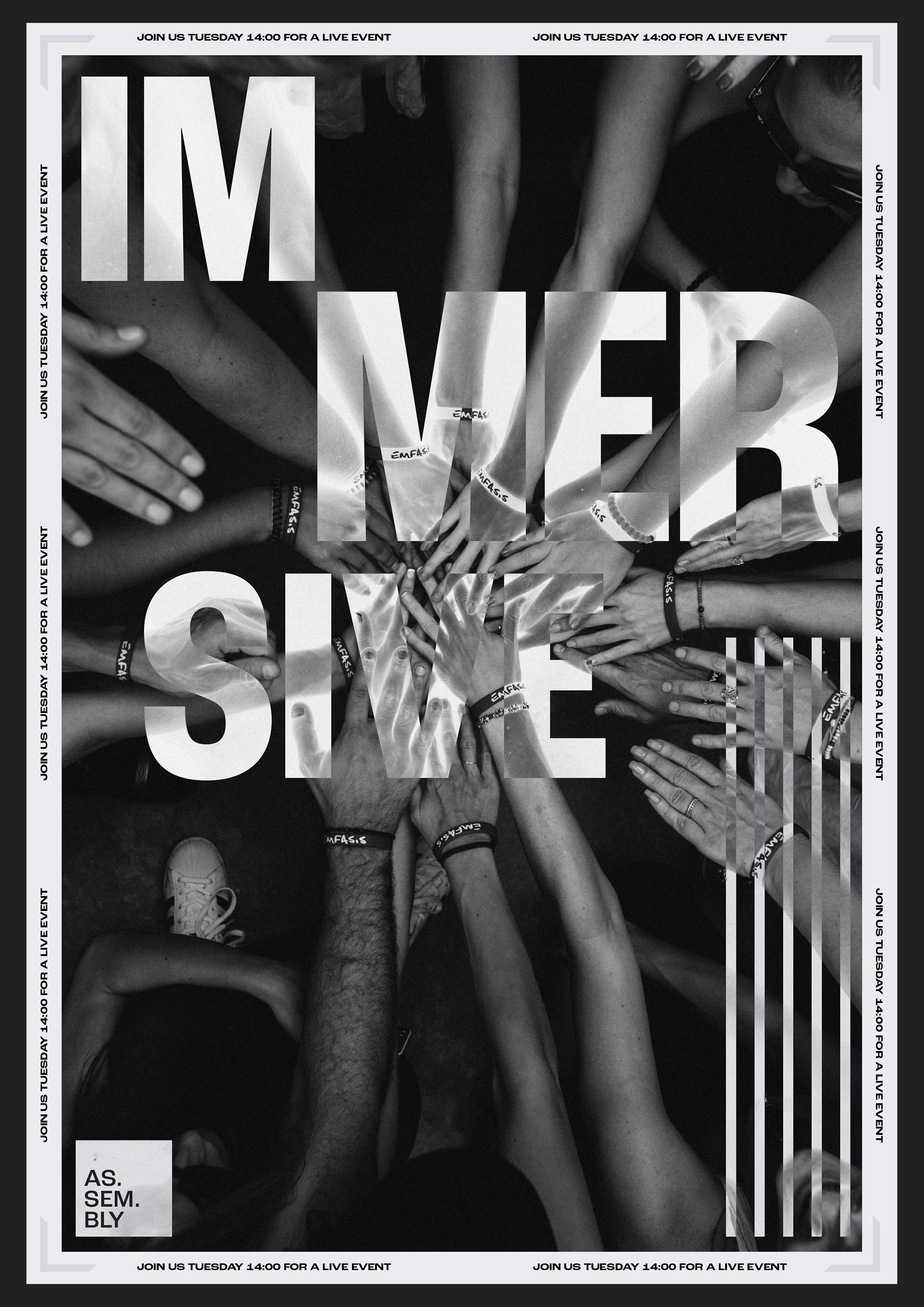
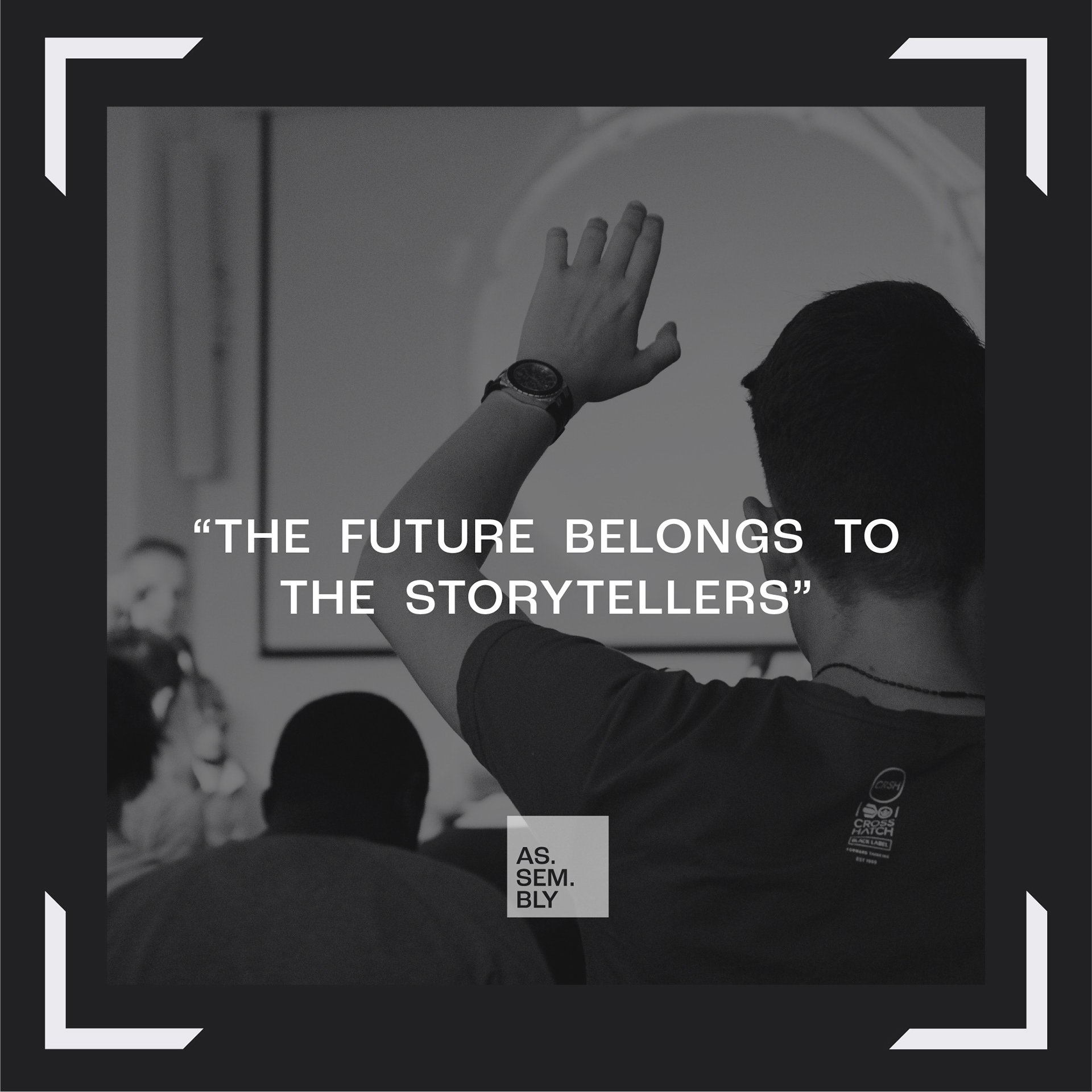
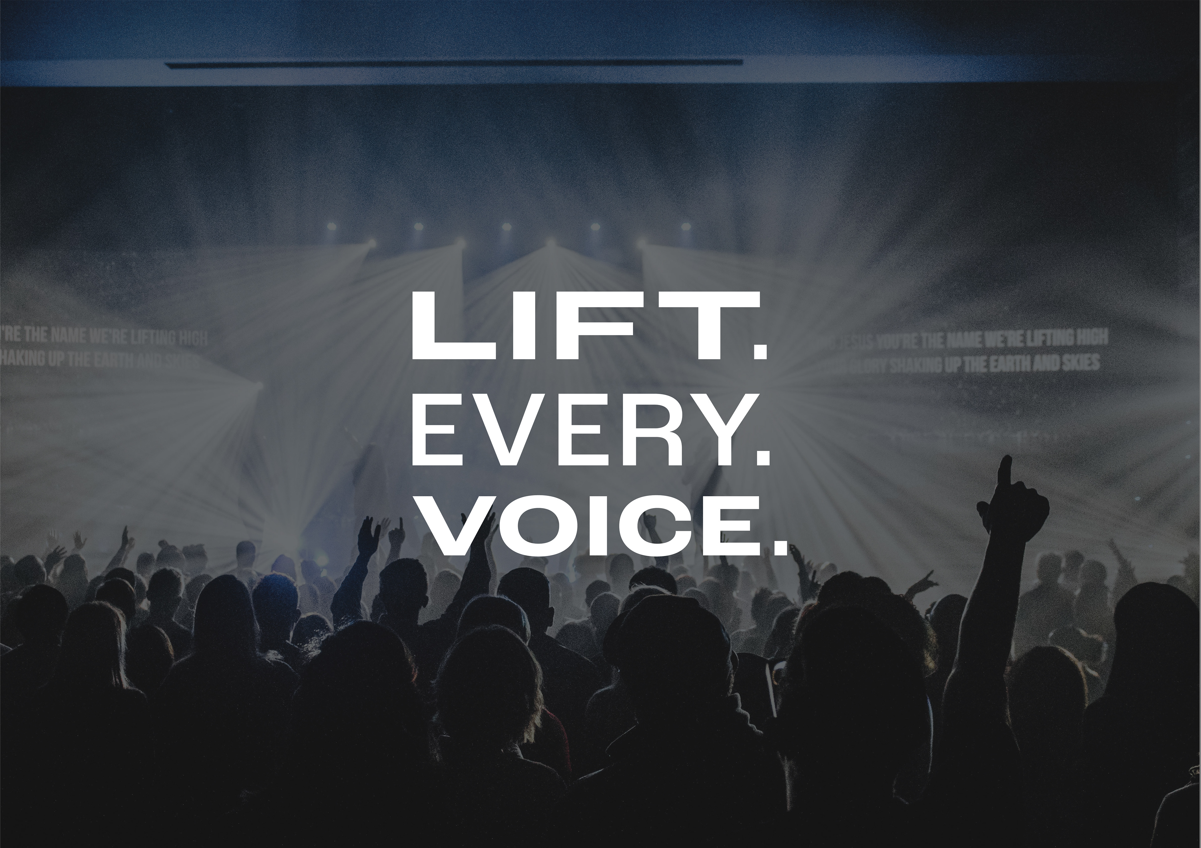
The typography and the way that it interacts with the user and content is essential in keeping the visual of the brand cohesive. Used in the right situations it can be clear and precise as well as playful, modern and edgy to suit the feeling of the information being presented. A strong sans-serif typeface, Roc Grotesk, was chosen to meet the challeneg of flexibility with its multiple weights and styles.